When Topps revived the Allen & Ginter name, they did a remarkable job staying true to the brand, while introducing some really, and I mean realllly cool cards. Metal, stained glass, silk, wood, glow in the dark, rip, framed/not-framed, etc.
It seemed to be only a matter of time when Topps would release the hounds, and create a superfractor version. It is something that many have been anticipating for years – the 19th century royal lineage of cardboard was on a collision course with the gold standard of 21st century baseball cards: the superfractor.
But could Topps pull it off? Would they? Should they?
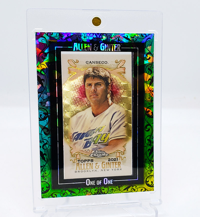
I’ll admit, I had my questions and doubts. How well would a 19th century style card mesh with a chrome superfractor? Most importantly (for me, anyway) how would it look for a Jose Canseco?
Last week, the questions I have had in my head for YEARS was finally answered.
Behold: The FIRST Allen & Ginter Mini Superfractor Jose Canseco
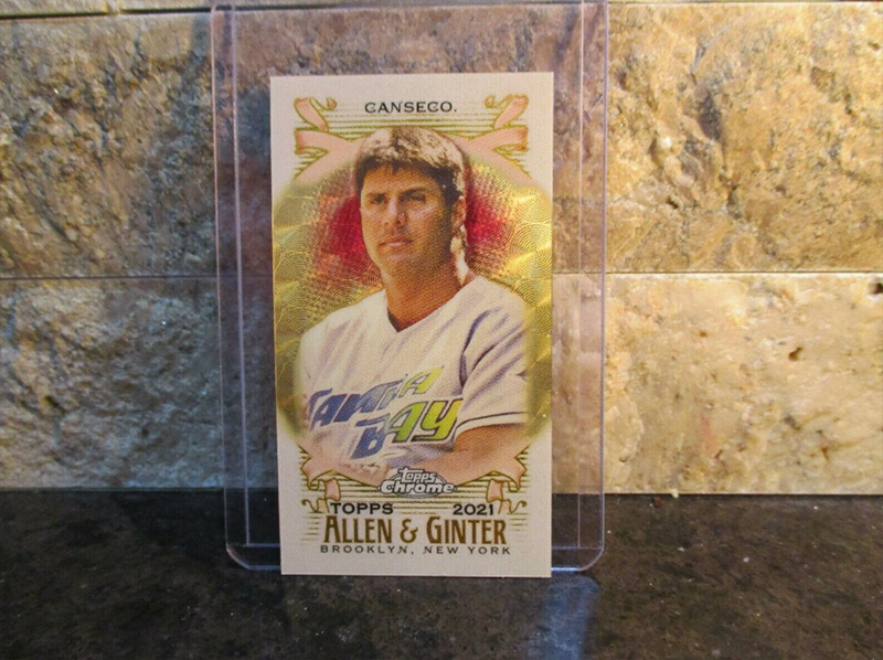
When it popped up at auction on eBay, my heart skipped a beat. I figured it would go sky high, and put it out of my head. After all, they’ll make others, right? About 30 minutes before the end of the auction, an idea came into my head to do some fun custom work. Plus, the thought that while Topps would surely make others, this would be his first ever A&G mini superfractor. Iconic. From that point on, it was all over. I knew I had to swing for the fences. To my surprise, it went under the radar, and I got it for less than I would have expected!
While the card is beautiful in and of itself, I really wished that it was in a frame, and had more … what’s the word I’m looking for … umph? Yeah, something that really catches the eye. I LOOOHUHUVVVVE Allen & Ginter minis, and I LOOOHUHUVVVEE superfractors, but this idea in my head could not be shaken, so I went to work!
I created an inner frame out of cardstock.
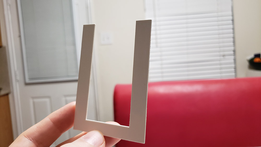
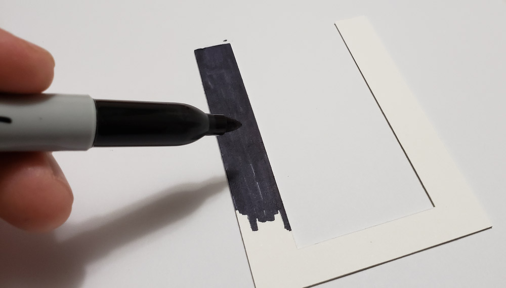
And decided I should color it black (as opposed to using black cardstock … whoops!)
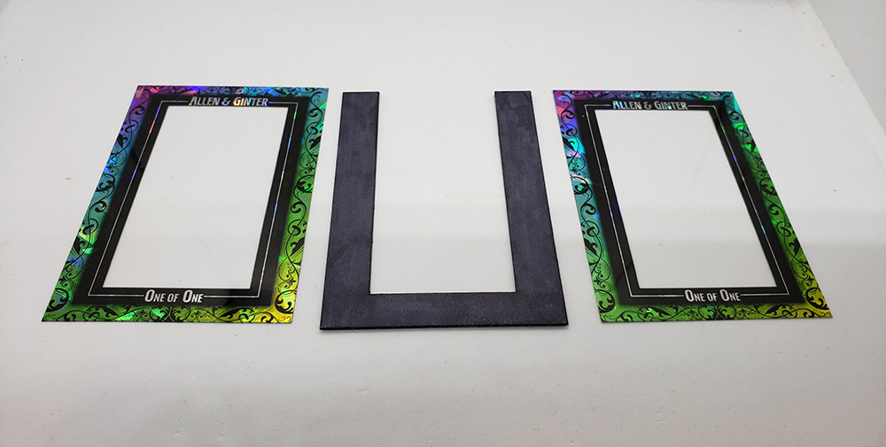
I struggled with the design for a long time. My initial thought was to use superfractor material, but after many, many, many tests, I found that the idea in my head didn’t translate how I had hoped, though it did set me down the right path. I settled on some nice victorian style artwork laid over Devil Rays colors, and atomic refractor material. Here are the three pieces used to create the atomic frame.
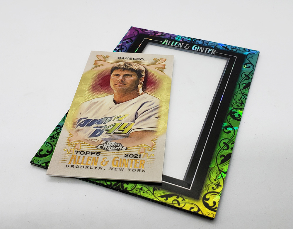
Completed frame with the mini about to be inserted:
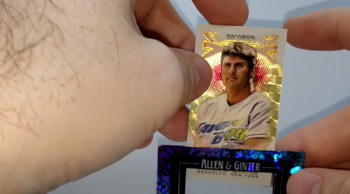
Remember the middle black piece that I showed above that looks like a “U”? That’s so I could slide it in and out whenever I wanted to, like this:
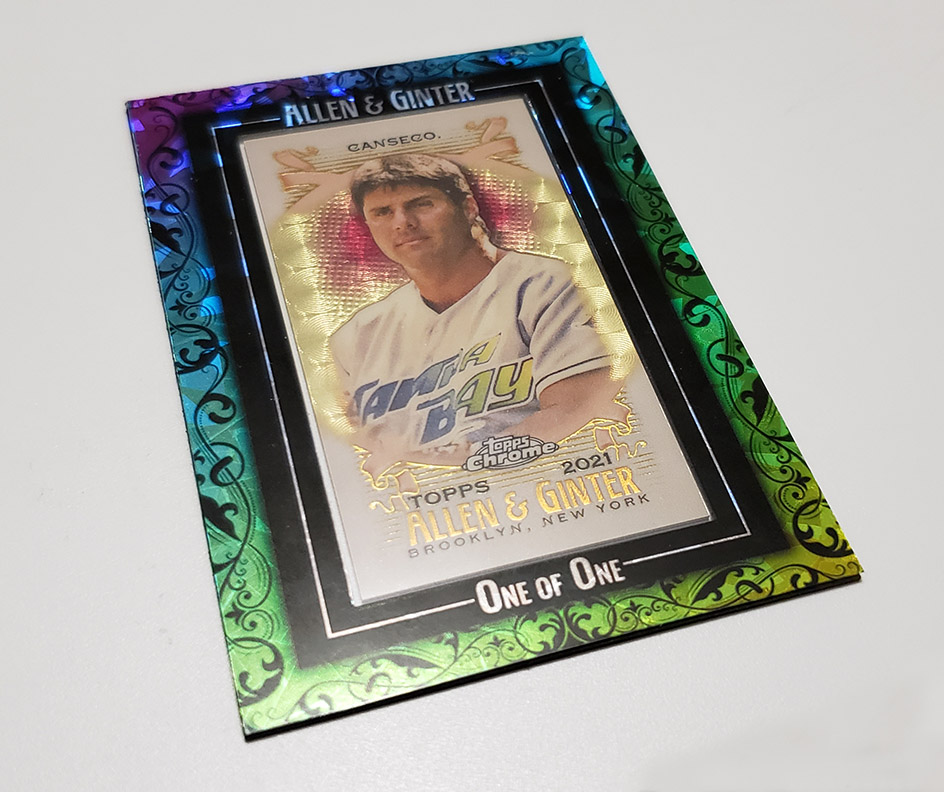
Finished product:
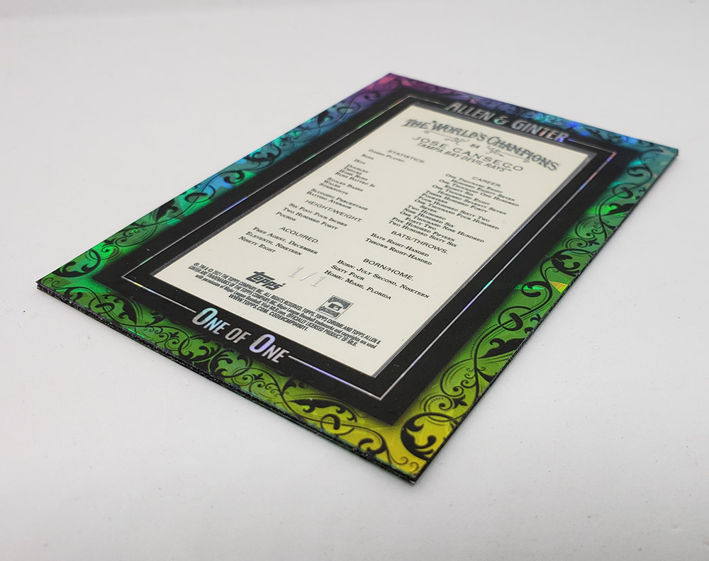
and the back!
The custom frame now gives me something extra fun to look at whenever I am enjoying the cards on my shelf. It also gives me variety, which I value highly in my collection.
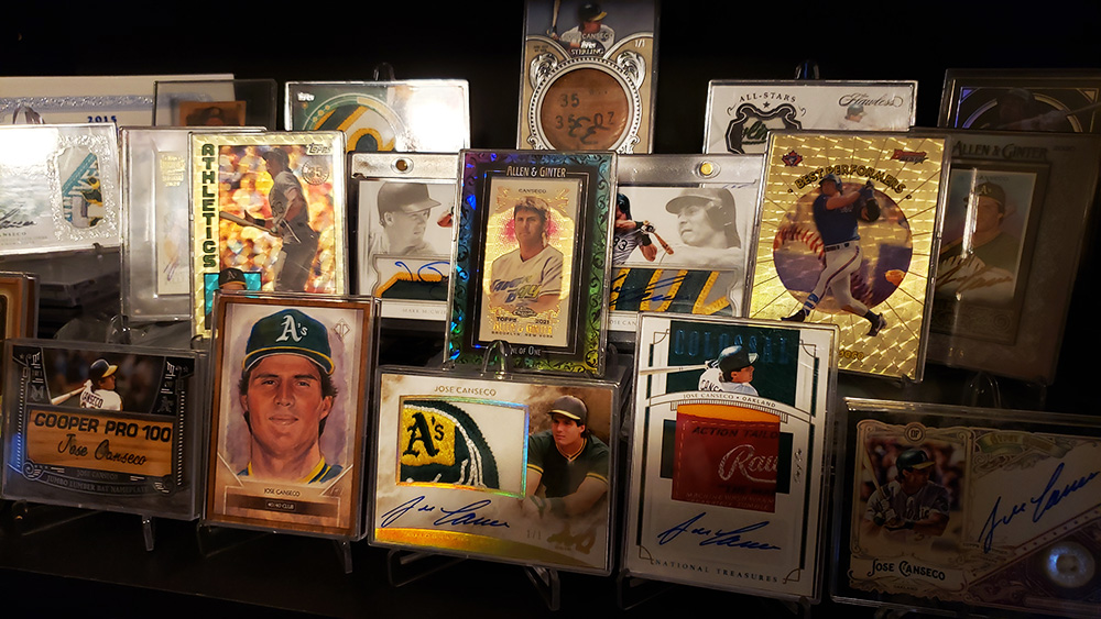
So there you have it: My first ever custom Atomic Superfractor!
Here’s the video if anyone wants to see it – I have some fun music playing as well 🙂


Leave A Comment
You must be logged in to post a comment.