Over the past three years, I’ve done a lot of different things. I’ve tried to do things that card companies have not done before. There is one thing I’ve shied away from, and that is using super premium pieces. It is coming up on two years since I was at Canseco’s house, and while I have no shortage of player-worn material, I have not done much in the way of custom cards with premium pieces.
The main reason for this is because I simply haven’t felt “good enough”, so to speak, to cut into a lot of the good stuff and do them the justice they deserve. Things have been heating up at work recently, and just like that … WHAMMO … I’ve had inspiration for the first time in a long time. It hit me all at once, to the point where I have three cards or so to work on, but for this article, I can only show one as it has taken up every single spare second I have had for quite a while now.
I cracked open photoshop, did some planning, looked around at the material I had available to me, and got to work.
But not before I had some fun with my friend’s picture he posted on facebook recently.
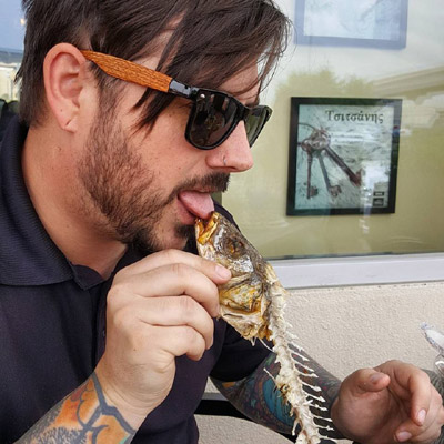
This semi-obscene picture was just screaming to be a movie, so I made it so.

Disappointed it won’t hit theatres? Well, apparently I was wrong….
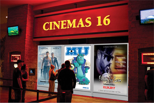
I know it isn’t baseball, but when you are riding the creativity wave, you go with it.
So anyway, for my latest project, I wanted to do something big. Something that included pieces I was previously not ready to use. Included in these are …
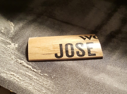
The Jose barrel piece shown below from the game used bat I cut up a while back. I wasn’t sure what I was going to use it for, but it turns out it was perfect for this project!
![[Image: Untitled2.jpg]](https://mycollectionofcards.com/baseballcards/043015/Untitled2.jpg)
Here it is, being sanded down for this project.
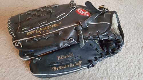
When I went to Jose’s house, I had brought along a few gloves for him to wear. We traded one (as you’ve probably heard me retell a million times by now), and he wore the others. This was not too long after he shot his finger, so I brought both a left and right handed glove to wear just in case he couldn’t put on the right handed one. Thankfully, he was able to wear all of them! This is the one I used for this project.
Here is a video of us talking while messing around with the gloves. Forgive me for looking and acting like a dork here. I was talking to my baseball hero!
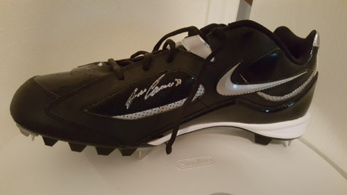
This project also includes a cleat. Fun fact: I researched what size he wore, and it was size 13. When I brought them out, he told me his feet have been growing since he was 40, and now wears size 14 shoes. Being a good sport, he crammed as much of his feet in them as he could, and did a funny little tap dance for us in them while he was sitting down. It was great!
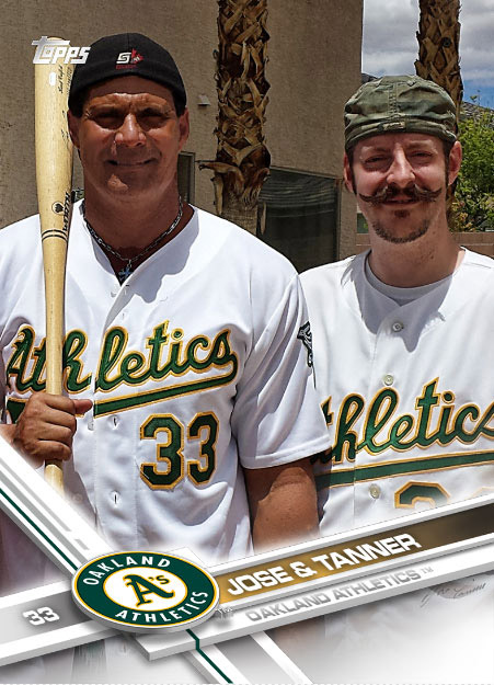
And last but not least, this project includes a jersey piece that I had him wear as shown below. This card was something I put together for my Topps guest blog. Check it out when you get a chance!
So, without further adieu, I present to you:
The logo / card name was actually something I designed after I did everything else. I tossed and turned on it for a while, and it seemed to come together nicely.
So, why blackout?
Well, because it’s black 🙂
Not just the design, though – everything is black. Normally when I do THICK cards, the edges look like this. I’ll show you in a bit what the edges look like now (I’ll give you a hint … they are the opposite of white.)
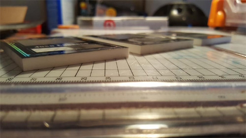
Even the top and bottom layers got the blackout treatment …
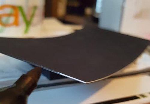
This project had so, SO many things go wrong. My least favorite of which is when I dropped it when it was finished, and I had to redo part of it. URGH!!!! Heck, I probably have half a trash bag full of scrap alone. Everything took so long, but I’m very happy with how it came out. Here is the back of it. The back and fronts are ultra glossy, so you see a lot of reflection on it.
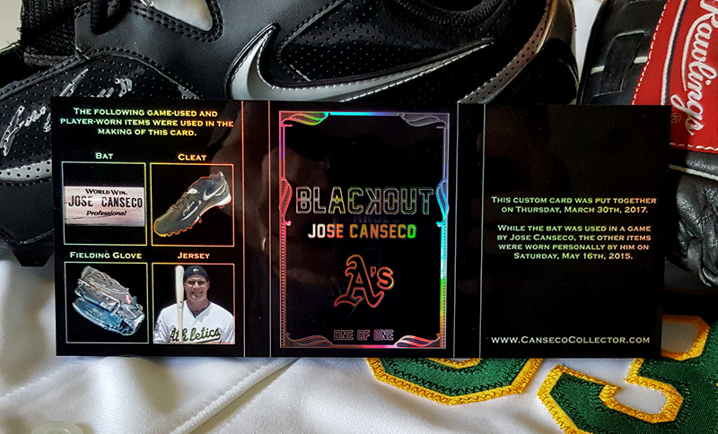
As you can see, the card is actually a triple booklet. I’ve seen card companies do this more and more recently, but nothing I’ve been mega hyped about (for Canseco, anyway!)
Here is what I came up with:
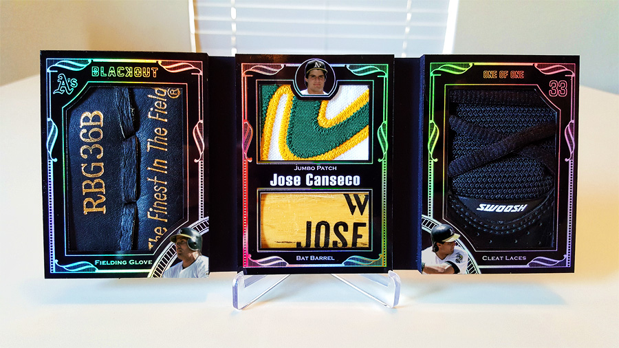
Though it was a HUGE pain, everything came together nicely. I had thought about putting a cap button in the middle instead of the patch, but I’m a sucker for a nice multi-colored patch, and I thought it tied in everything quite nicely, with the rest of it being black.
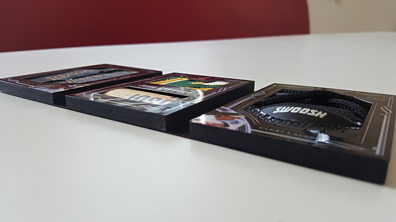
See how the edges turned out? I LOVE the whole thing in black, and love how thick it is.
It refracts light beautifully, but unfortunately one picture alone cannot do it justice. Here it is using the new animated gif process I came up with. It still doesn’t show as nicely as it does in person, but I think it does well.
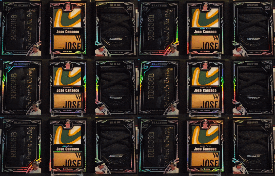
Yeah, I like that 🙂 Last, but not least, I thought I’d do an artsy shot of it with the pieces I used to make it. I’m not sure what part exactly I like best about it. I LOVE The glove, but then again, the jumbo patch and bat barrel seem to go so well together. Then, the cleat laces … yeah, that might be my favorite part. I dunno … I can’t pick!
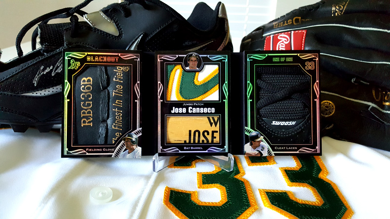
All I know is if a card company came out with something like this, I think I’d lose my mind. I think this is my favorite custom I’ve ever made, and am glad it all worked out, even if it took forever.


Wow Tanner that card looks amazing! The best card you’ve created so far!!!!!!!!!
Thanks! 🙂