For every baseball fan, the ultimate best feeling you can have is when your team makes it to the World Series – and wins. For me, that point was in 1989 when the Powerhouse Oakland Athletics took their cast of super stars & veterans to beat the Giants.
I remember being glued to the television and begging for my parents to put the game on the radio if we had to drive somewhere during game time. I also remember the earthquake – and feeling it, too.
I remember Dave Stewart being virtually un-hittable. I remember the swagger that Canseco and Henderson had – they oozed confidence. The infectious smile of Dave Henderson. The dominant and fearless look that Dennis Eckersley had each time he took the mound.
I also remember being heartbroken when one by one, my heroes were traded off and retired. The A’s were no longer the same team I had rooted for. As a matter of fact, I find myself rooting for the Astros wholeheartedly this post-season – such strange territory for me.
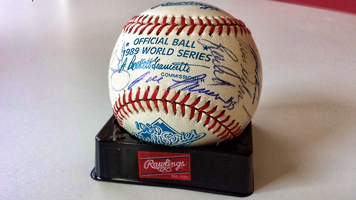
Nevertheless, the 1989 Oakland Athletics will always be my all-time favorite team. You may have read that one of my favorite pieces in my collection is my game used 1989 World Series baseball signed by the entire team.
While I love it, I wanted something more on the high end side that was in card form. The card companies will likely never make anything really cool that commemorates this team, so the gears in my head started turning about a year ago.
So, this is where we begin our journey: In my brain.
I have done a book card with Canseco and McGwire, but what should I do this time? Should I add Walt Weiss? All 3 were consecutive ROY award winners, and played in the ’89 World Series. But, what about the man of steal, Rickey Henderson? Would it even make sense for those 4 to be together?
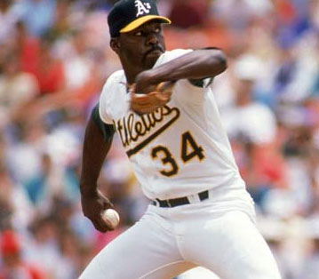
Eckersley and Dave Stewart, too.
What about Dave Henderson?
Speaking of Daves, what about Dave Parker?
I’d be a fool to forget Mike Moore & Terry Steinbach….
As you can see, this thing got hairy, quick. I have been mulling it over for a long time now. The challenges I had were:
– Should this be an oversized card, or a booklet?
– If it is a booklet, how many panels?
– How should I design this sucker?
– How will I determine who will be featured in this piece?
– How the heck will I get all of the autographs I want – especially ones small enough to fit inside of the cut windows?
– When will I find the time to do this, anyway?
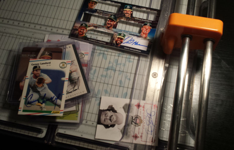
As you can see, I had a lot of things floating around in my head. I decided to start researching how to get autographs, and slowly but surely I was able to gather who I wanted. It was maddening to try to find autographs that would work though! Index card autographs were typically too large, and some players didn’t even have autographs available online.
Through constant searching on Ebay, I was able to pick up a handful of workable autos. I had a direct connection people who had relationships with some of the players, I picked up another from a card show and I was even able to get one through the mail for a small donation.
After several months of searching, I had all the pieces that I needed. I would say among the most difficult to obtain workable autographs were Terry Steinbach and Mike Moore. Steinbach signs loooong, and Moore signs TALL. I would say several others were more difficult to get as well, as players typically seem to sign bigger than I needed.
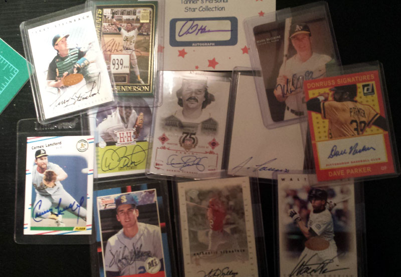
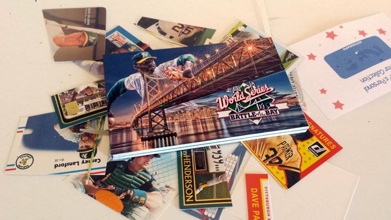
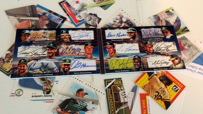
A nice smattering of blanks, in person autographs and certified pack pulled. Some on sticker and some on card … all obtained from various different places. Clearly, a VERY diverse collection here.
If you are counting, then you know this could be huge. TWELVE autographs, if I used them all. For the typical A’s fan, this would be quite a cool collection to have in and of itself.
Well….ahem….let’s just rip this off like a band-aid, shall we?
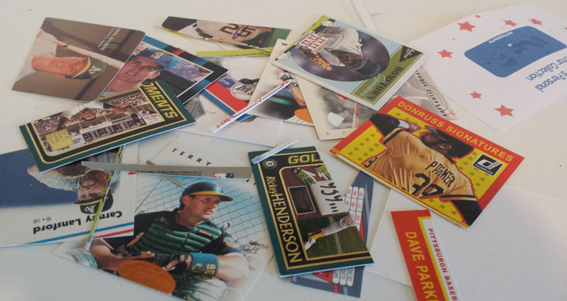
Yeah, it got bloody….errrr….cardboardy?
Based upon what was available, I knew that this wasn’t going to be a project made of clean, perfectly signed white/sticker autographs, all in unison on a sterile design. This was going to be an explosion of colors and styles. I was perfectly fine with this, because that describes the 1989 Oakland Athletics to a tee!
For design, I didn’t know which way to go. Should I use a picture of the players jumping up and down in the middle of the baseball diamond after having won it all? Nah, that’s been done before. What about highlighting the earth quake? I had done that previously from another card.
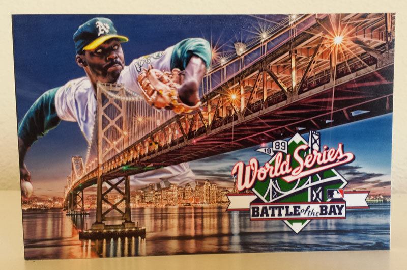
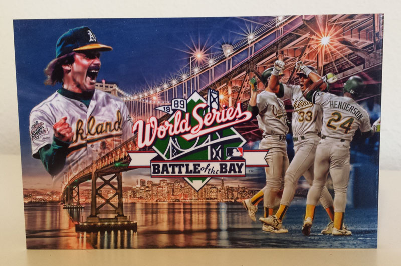
This was the “Battle of the Bay”, or the “Bay Bridge Series” so I decided to focus on that. I found a cool pic of the bay bridge to use:

After a little photoshop magic, and adding in a little Stew ….
And WHAMMO!!!
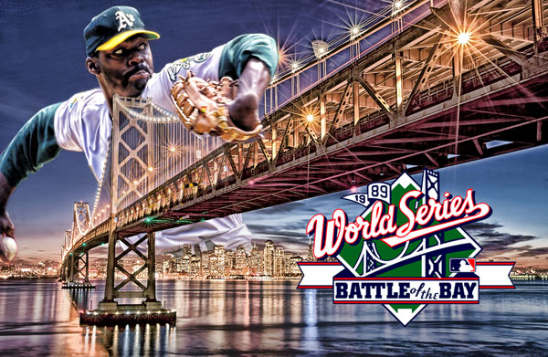
’89 World Series MVP Dave Stewart takes over the Bay Area, Godzilla style. I thought this would work nicely for the front, and I definitely wanted the “Battle of the Bay” instead of just the regular World Series logo.
For the back, I thought it would be cool to do something that showed victory.
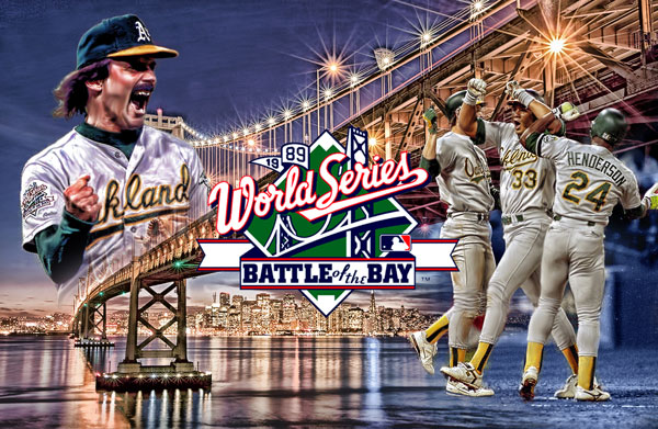
Eck in vintage form, making the last batter of the game cry. The graphic treatment on the right came out really sweet – first, it is Canseco giving Henderson and (Steinbach, I think) the bash while celebrating. You hardly see that out of him. The cool graphic part though is the ground – it seamlessly goes from the baseball field to the water. I thought that was pretty slick.
So, as for size, I went back and forth.
Oversized card, or booklet?
Oversized card, or booklet?
Wait … WAIT. What about Oversized AND booklet?!
I hadn’t done something like this before, so that in and of itself was intriguing. I had seen some Allen & Ginter cabinet booklet cards, and figured why not try something bigger in booklet form? Not everthing has to be 2 1/2 x 3 1/2 to be collectible, right?
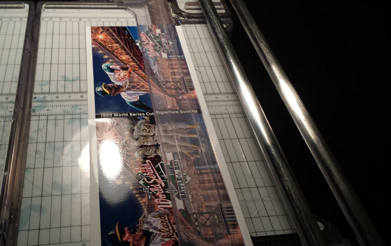
So, here is the cover printed out, and ready to be cut ….
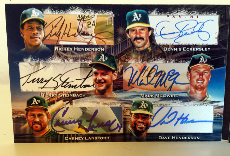
The inside of the book is where the goodies are, of course. For design, I wanted to use the same bridge background, but mute it a bit, because I knew already it was going to be loud with all the colors and inks used from the autographs. Here is this inside, printed out before the windows were cut.
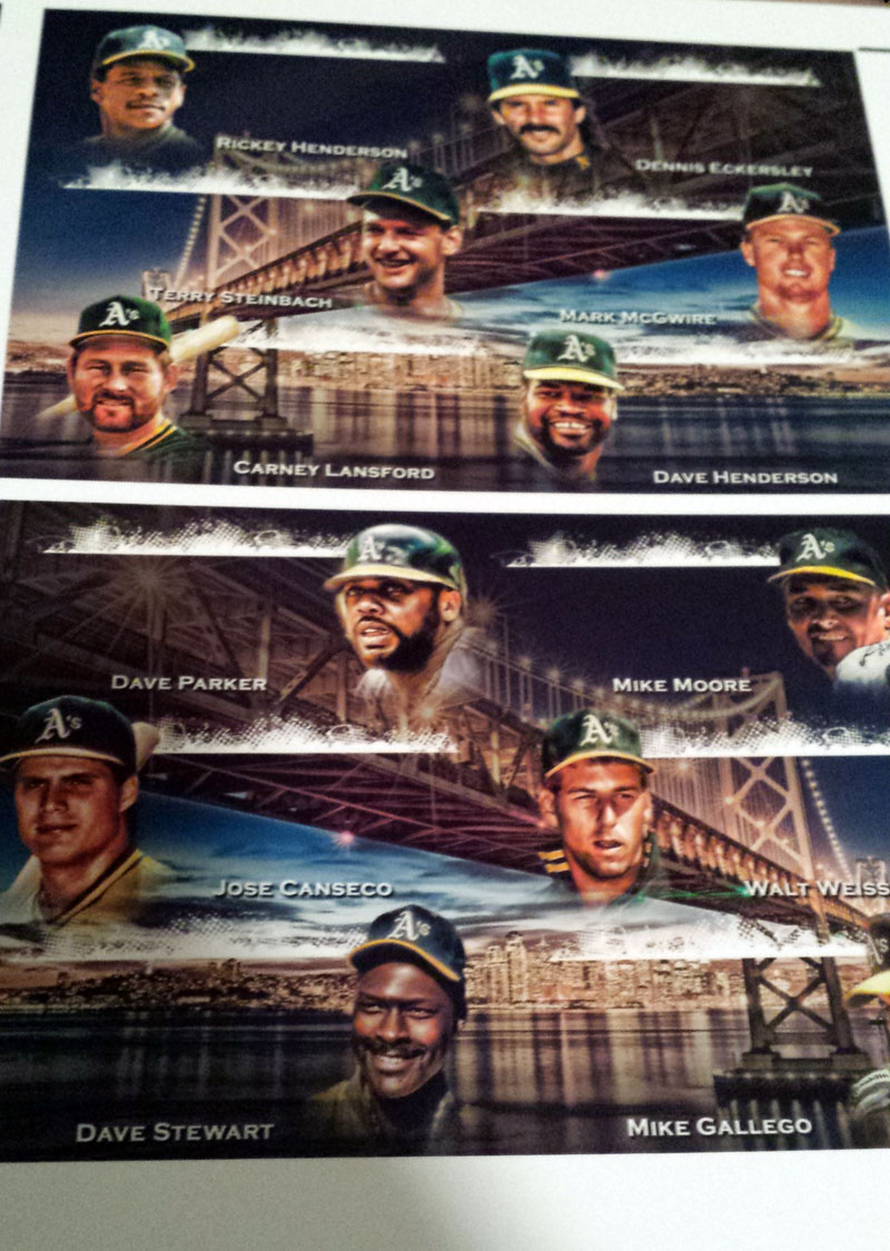
A significant amount of time was invested in getting the “look” right for the players. Simply put, there are not many pictures out there of most of these guys that were workable. As you can see, I gave them all a “museum” kind of look to each one, and faded them from the neck/shoulders down. The graphical treatment on each portrait took forever. The top splash of white marks where the top of the cut windows will be. I love this effect, so figured I’d keep it in.
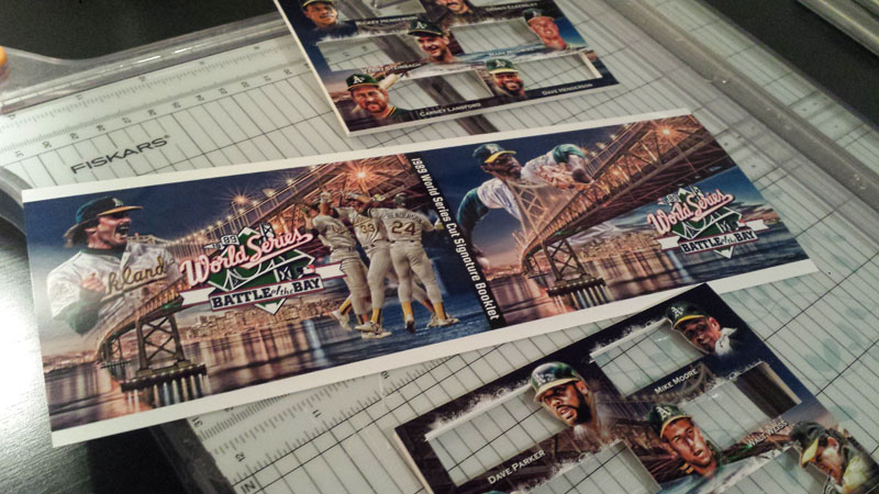
While designing, I thought to myself, what if I do a bit of a silhouette kind of cut to the windows, instead of just a rectangle? Something where the side of the window with the picture has the outline of the player’s face?
I would like to say that Carney Lansford’s bat/shoulder silhouette was on purpose to fit the “C” in his name, but truth be told, that was just a happy accident.
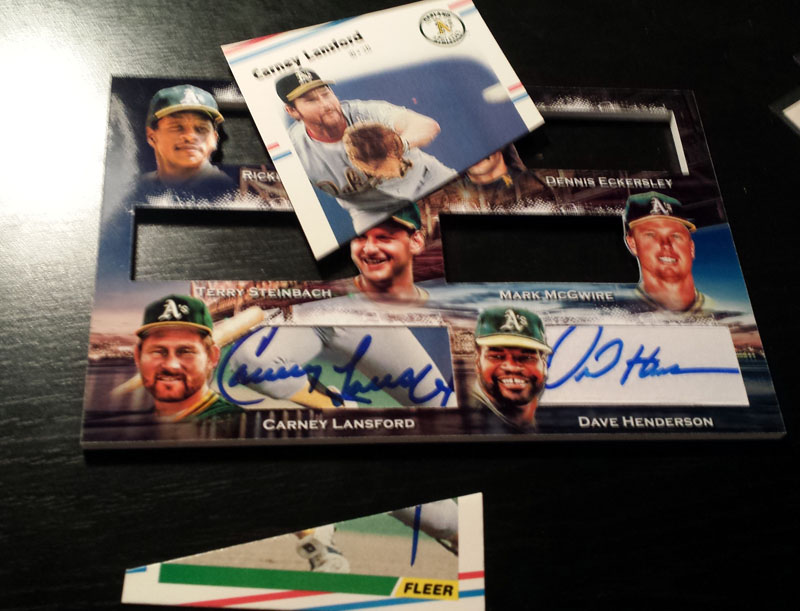
No! Not Eckersley!!! AHHH!!!
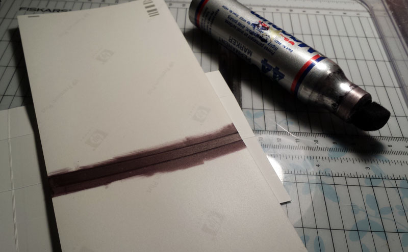
Ever wonder how that black strip for the inner binding of booklets gets there? Well, this is how I do it. Rather, this is how I did it for this book. (I’ve done gold strips in the past, as well as graphics, etc … I just wanted to go black this time!)
Ever wonder how the booklets are folded? My scorer is MIA (I looked for like an hour and couldn’t find it!) Well, here is what the pros use … a pizza cutter, LOL!
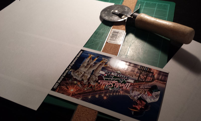
I don’t ever create bends in the books I do, but since I don’t have a holder for this yet, I wanted it to bend a bit for display purposes.
I went to bed at about 2 or 2:30 last night after working on this. When I woke up, I challenged my wife to find the T-Rex wearing a dunce hat in our ceiling. Can YOU spot it? It is plain as day to me.
Sorry … moving on….
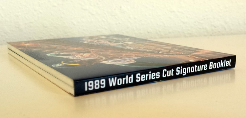
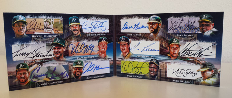
Here it is, in all its glory!
Folded
The Front
The Back
The inner left
Inner Right
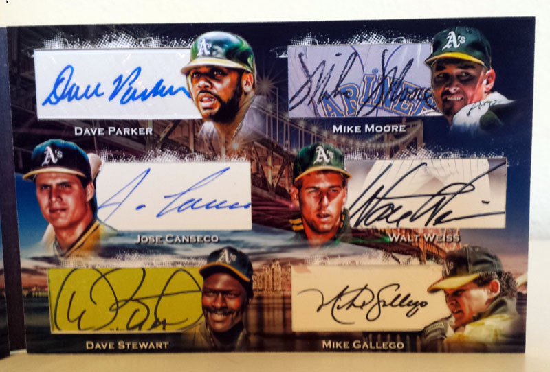
The entire inside (Note I placed McGwire & Canseco together, as the bash brothers should be!)
Pardon me, if you don’t mind me taking a few artsy pictures of the finished product sitting on top of all the hacked up cards …
And last but not least, a pic of it with my autographed baseball …
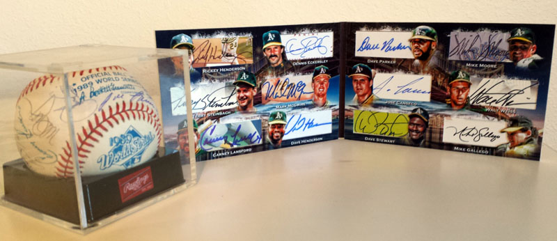
After I finish some projects, I’m left with an “eh” feeling … where others, I think WOW! I love looking at this! This is one of those WOW pieces for my collection. I really enjoy looking at it. I hope to get a holder for it soon – which, by the way, measures just over 11 inches long and is just over 3 1/2 inches wide.
Thanks for reading!


Very nice work! Although seeing the Mariners logo behind Moore’s auto is a bit disconcerting…lol 😉
I can only work with what I have! 🙂 In all seriousness, it was that or using an autograph where only half of the auto would show, which would look very messy. Thanks for the kind words!