One card I have always loved the look of are Sweet Spot Signature cards. I think the idea was brilliant. Put a baseball cover embedded in a card, and have the player sign. Greatness!
But the question looms: Do they really use actual baseballs?
Upper Deck had various output issues. As you look at them through the years, you see different outcomes. Here is one that they did use a real baseball:
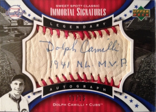
Kinda scrunched up. That isn’t mind thing (though, if I had that card, I’m sure I’d be happy!)
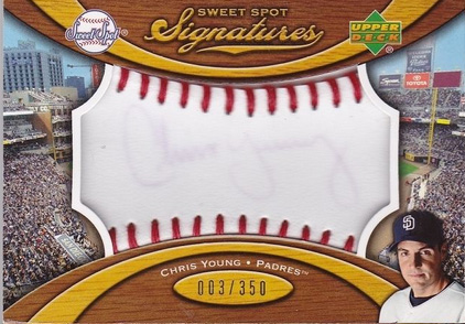
They also apparently tried a different type of material, but the signature wouldn’t hold up:
I’ve been wanting to try my own thing for a little while now, and after several failed attempts of looking for the right type of leather for it, I thought to myself “why leather?”
I knew I wanted something textured, but this past week, I picked up some material, as well as some different types of pens and markers to see how well they worked together. I love blue, red, gold and silver. The material I picked up was a piece of black, and a piece of white. It has a bit of a pearlescent tone to it, and the texture seems like it will do wonderfully as a placeholder.
I even did some tests on how various inks would look after getting my creations autographed:
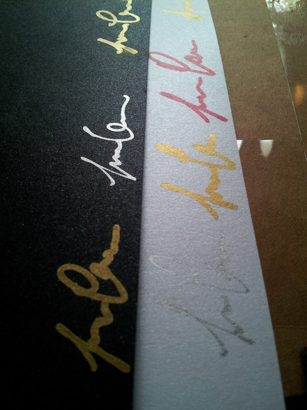
I think they look great!
So after many, many hours of trying to perfect a baseball cover template with holes in the right area, I ended up making several to bind them together for a thick piece, so twine could stand up to them.
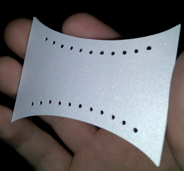
I got a bunch of different colors of twine … (remember the card in the background? Everything’s better at Mouschi’s!)
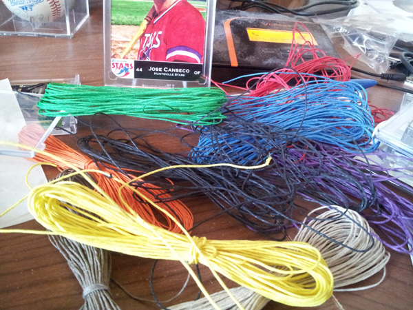
And went to work …
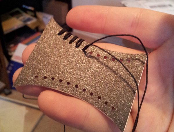
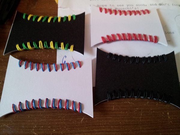
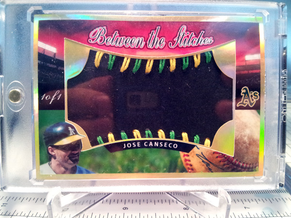
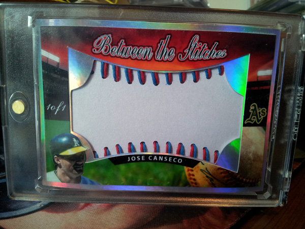
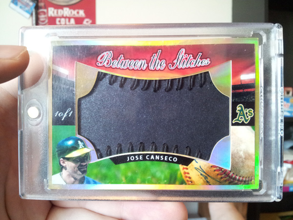
I wanted to do several flavors. Classic red on white, alternating double stitched green & gold on black, single alternating stitched red and blue on white and finally, black on black.
After that, I did the design work, and had my son model them … as glasses …
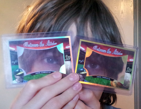
Here is how it all came out!
Green & Gold on black w/gold holofoil(I’m starting out with this because I like it the least)
Red & Blue on white w/silver holofoil
Black on black with gold holofoil
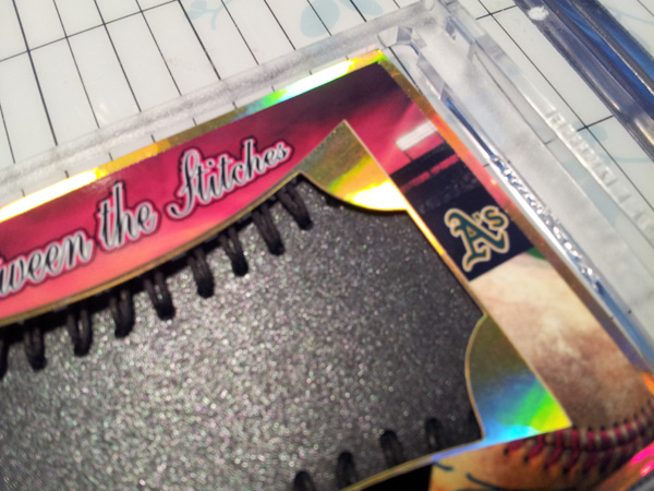
Here is another shot to give you an idea of how the texture is (man this is gonna look sweet signed in gold!)
Finally, classic red on white with silver holofoil…
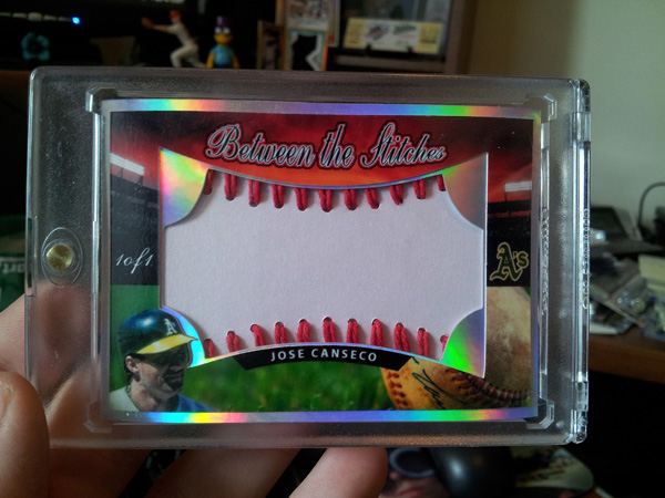
If you look closely in the logo, you see I did something on it and made it look like the logo was being stitched …
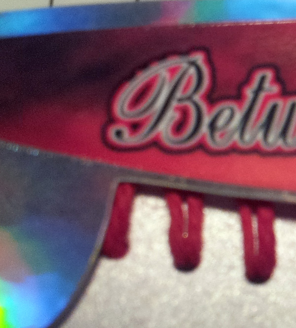
The ball in the foreground is also autographed by Canseco (thanks to photoshop!)
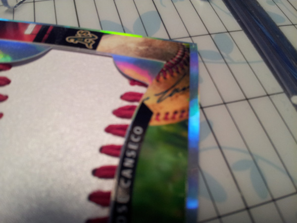
As a matter of fact, the entire picture is manipulated. This is a few pictures, with various treatments. It initially was a picture of a ball close up, and a picture of a zoomed out stadium with a clear sky. I merged the two, to make it look like a picture was taken of a Canseco autographed baseball from the outfield, which shows the rest of the stadium from the baseball’s perspective … with some pretty wicked looking sky effects.
You can’t really see what all is going on too well when you are just looking at the pictures of the cards, so here is a shot of the photoshop work …
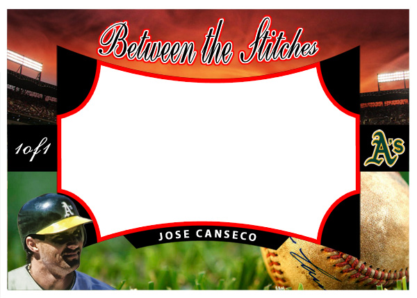
I have not fully produced them yet – I just staged them here to show what they would look like. The odds are, I will be creating 1-3 more different designs so I can have different types of sweet spot type of cards. For now though, I really like how the design work came together on this first one! Needless to say, I cannot wait to get these puppies signed.



Leave A Comment
You must be logged in to post a comment.