If you are a fan of television like me, you may watch the singing or talent shows, like America’s Got Talent. I don’t care how many years it has been on, and how annoying the host / judges are. There is just something about robotic dancers and people that juggle poodles that sing to me.
But then, they have more “cultured” entertainers.
Like opera singers. Or men dressed up as women. Or men opera singers dressed up as women.
I confess, I don’t really get that. I watch in awe and the camera pans from the entertainer during the performance to the judge who looks like their soul is 100% invested into the act. At the end, they do a little of this …
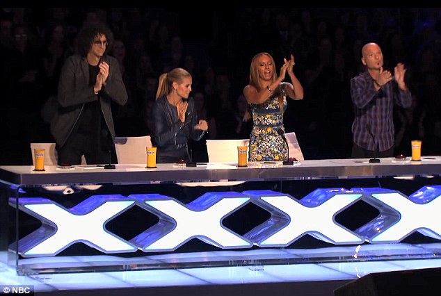
And I don’t get it!
I immediately think of a couple scenarios:
A) Am I not cultured enough? Perhaps I’m too dumb to enjoy something so exotic and elegant.
B) No, it isn’t me. It’s not me at all! It is the judges. There is no flippin’ way they can be enjoying this junk. They must be putting on a show so viewers like me feel stupid for not enjoying it as well, and then the sheeple will start enjoying watching men dressed up as women to sing opera.
But then again, the flip is true. They may have a singer that I *really* connect with. And they don’t click with it. I think what???? This dude was brilliant, and you kicked him off? Not to mention the fact that I feel like a fool publicly displaying my affection for one of these folks before the judges to speak. I mean, what happens if the judge says someone was awful when I just said they were brilliant?
All that to say, the same might be true with my latest custom. I can see how people may not “track” with me with this card, which is okay. Not everyone has the same taste, and not every card can receive a standing ovation from all four judges 🙂 I must admit, I thought it was fantastic, but my wife said otherwise.
Earlier this week, I did a custom booklet of Jose Canseco called the 2014 Rookie Recollection. I was thrilled with it! Even though it cost the lives of a few innocent Canseco rookie cards, I couldn’t be happier with it.
Then, I thought to myself … why stop there? Why not destroy a few books as well? If you aren’t aware, Jose Canseco has written two books: Juiced and Vindicated. Surely, you have at least heard of them before.
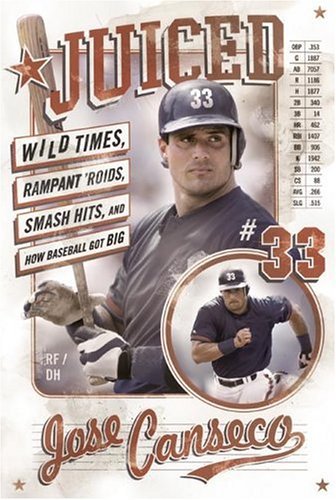
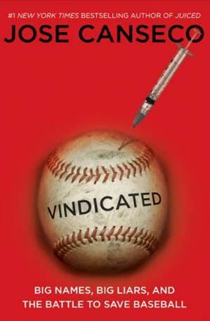
For those of you who have a favorite player who ended up writing a book, you know – this stuff is gold. It is great to hear the thoughts of your favorite player in 200-400 pages. Very fun stuff!
The problem for me is, when it comes to collecting, for some reason – the collectability (is that even a word?) goes through the roof for me if it measures 2 1/2 x 3 1/2 inches. I don’t know why, but I just love collecting cards more than I do memorabilia and oversized cards. Perhaps it is because the standard size for cards fit nicely in boxes. Maybe it is because I don’t like clutter. Or maybe it is just because I have too many bad memories and frightening flashbacks of what bowman did to their 1989 set.
Either way, I felt compelled to make something that commemorates Jose’s books he wrote for my collection – and sign it later. I have been thinking about something like this for a few weeks now. What if I took a piece of the pages of each book and make a custom book card? Not a book card that opens up, but a card that has the book pieces in it.
I had been meaning to pick up his books anyway, so believe it or not, I found his two and one of his ex wife’s books about their relationship for something like $6 total. Score!
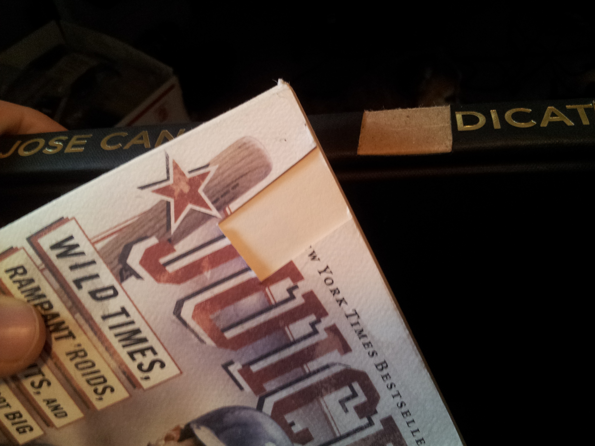
Unfortunately, the cover of Juiced had seen better days (there were even human teeth / bite marks on it!) and the Vindicated book didn’t have a cover. That was fine, because I only wanted a sliver
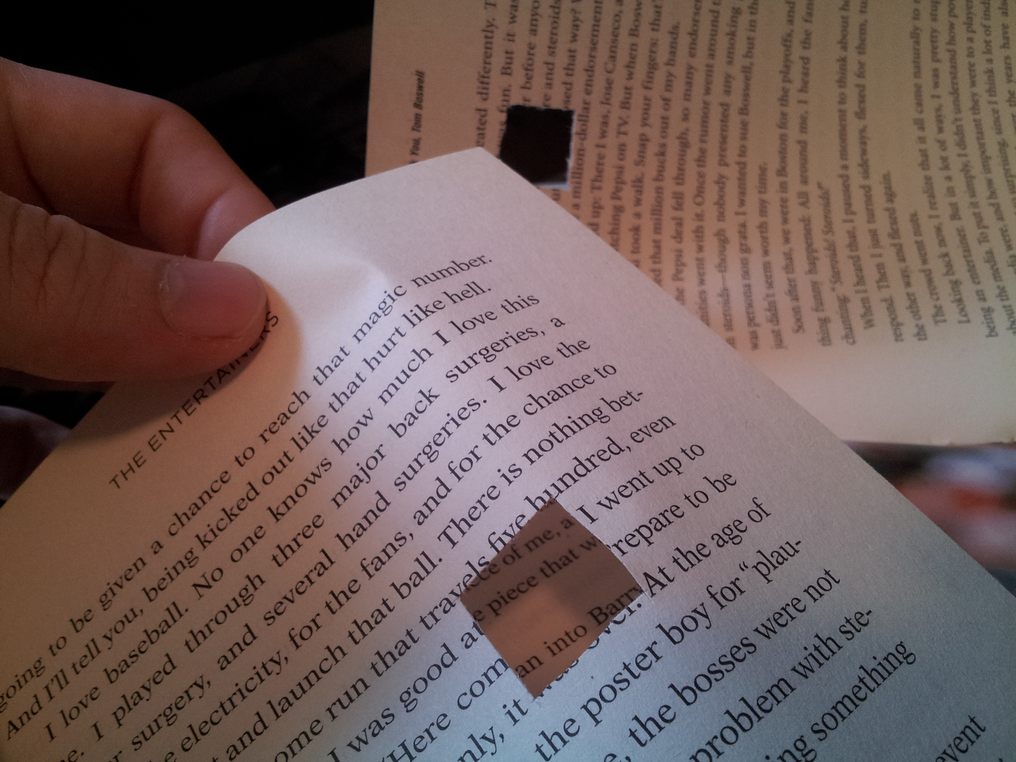
Soooo, here is the carnage ….
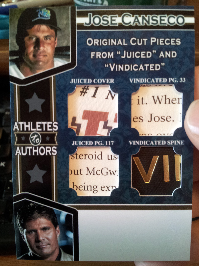
I wanted some clips that said something about McGwire & Steroids. Then I wanted another cut that was from page 33 with Jose’s name on it.
Then, I decided why not use the cover and spine? LETS DO THIS!
The end result ….
My concern was the small area for Jose to sign. I also wanted an inscription, but I’m not sure that would happen with this.
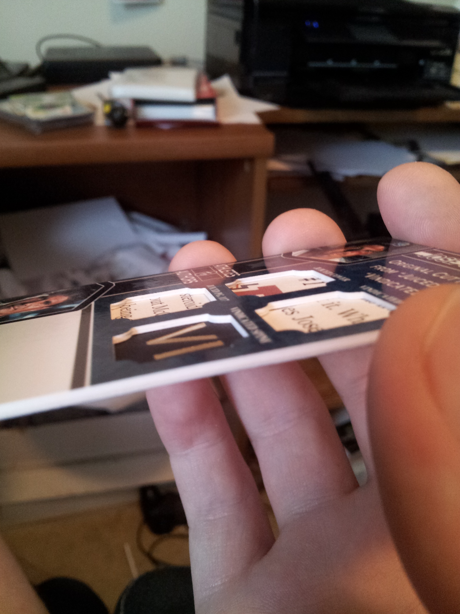
I wanted to give the cut pieces a deep dish effect, so I made the card extra thick …
So, I went to bed after creating this … probably at about 2am. I was very happy with it. But that wife of mine happened. When I showed her, every moment of silence was disheartening. She came into the office later and said she thought it was too busy. I told her that this is one time that even if everyone else didn’t like it, it would be one that I love. I still look at it now, and really like it. The problem? She posed a question:
“Uhmmm … babe … it is *ATHLETES* to Authors, right? Why not have a jersey piece or something in it as well?”
Why … the … heck didn’t I think of this before? It made sense! Then I started thinking even more about it. What else could be done? I already had a number of hours into the design and production as it was. If I was going to redo it, I might as well REALLY give it a go.
So, I cracked open Photoshop and started playing with the design. Then, I started thinking … what if I put in a piece of the baseball I got at the Astros game in it?
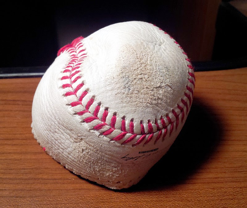
Yes yes yes! This could work! I could put in part of the Rawlings logo in it.
Then, my wife came in asked what I was doing. She said “why not use the stitchings instead? I think that would look cool.”
“But…it can’t be done. It is too thick. Too difficult to work with. That would really be hard.”
Then, I thought about it more … that would actually be cool. I’m gonna try it, dangit!
So, after messing with it for a while, we had some good ole family time …
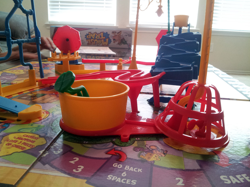
Mouse Trap, anyone? I lost. It was my first time playing, so back off! 🙂
When family game time was over, I retreated to the office to listen to my A’s whoop up on the Rangers this and I finished up the real Athletes to Authors card:

I love that there are game used pieces. I love that it isn’t as busy, and I love that the bottom has more room to be signed on. There is still something about the first one that I did that I like. I might redo that one also to be a card that doesn’t need to be signed, perhaps.
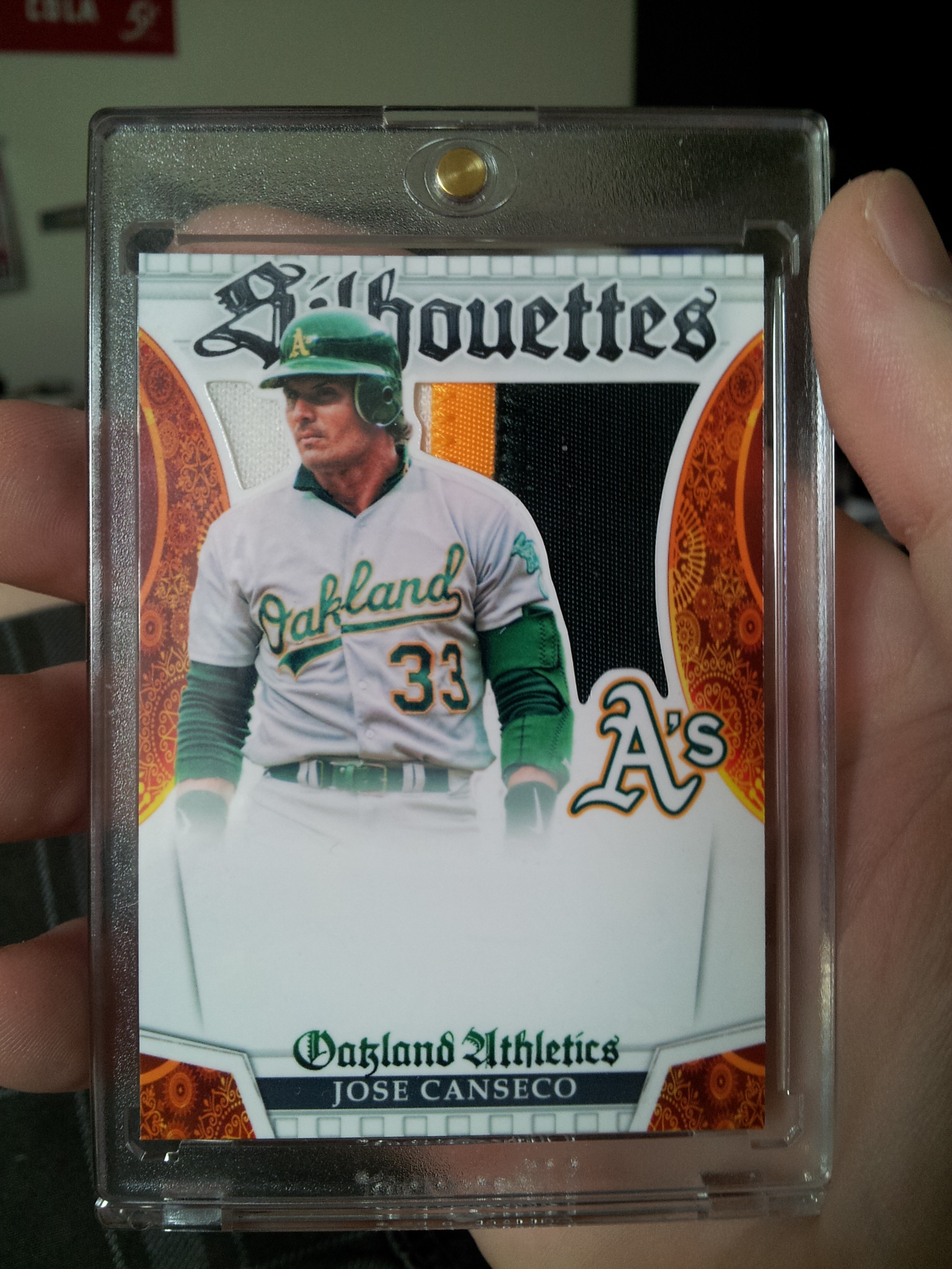
Last but not least, is possibly my favorite…or at least top 3. I had been looking online and stumbled upon a design of a card I really enjoyed. It is a basketball card called Silhouettes. I thought it would look mega sweet with a few modifications to have a baseball card version … a baseball card version of Jose Canseco, of course!
It was quite difficult to reconstruct, but I did it and I made several changes & enhancements to fit my design tastes. Here it is!
So, that’s a wrap for this edition, folks. Thanks for reading!


Leave A Comment
You must be logged in to post a comment.