Not too long ago, I opened myself up to the world of custom cut autographs. I made these “nAutos” (not-autos) –
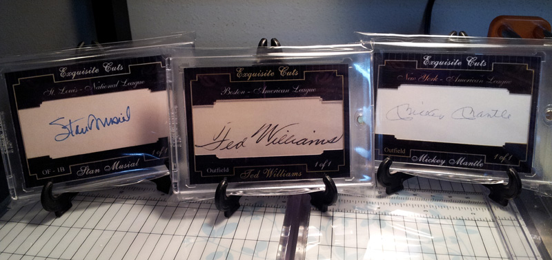
I thought they came out pretty slick, even though there wasn’t a picture of the players on them.
It was from this point on, (actually, before this even) that my entire collecting / custom card creation hobby was turned around. Everything that had an autograph on it became a potential 1 of 1 masterpiece in my head!
A Mickey Mantle signed … ANYTHING could be turned into a work of art ….
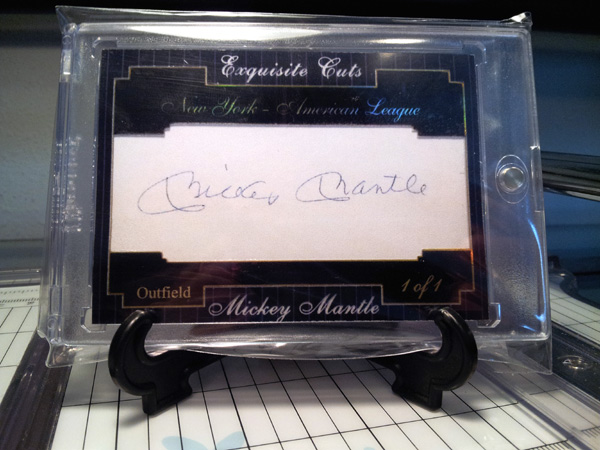
All of the card companies do it…why can’t I? I’d much rather a “custom 1/1 cut auto” of the Mick, than a signed crusty handkerchief any day.
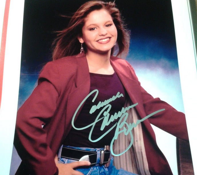
The same goes for this … from my childhood crush, DJ Tanner from Full House (Candace Cameron). Or
Why not Uncle Jesse?

(Actually, I guess a better question would be “why would I make something with Uncle Jesse…esp. w/out the mullet.)
Editor’s note: I do not in fact have the 2 pictures above … I just grabbed it from online to make a point.
I do, however, have these from some TTM successes:
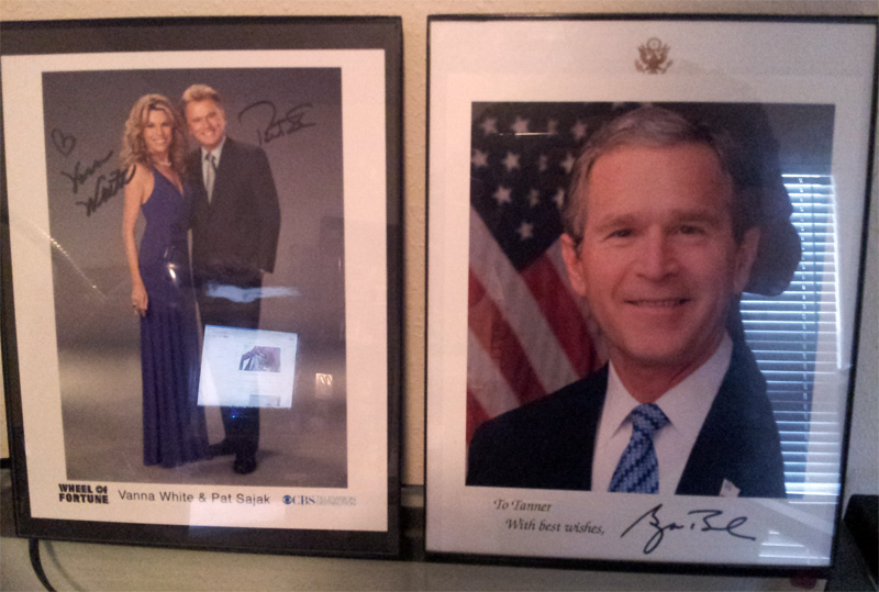
(Dubya is autopenned, but honey badger don’t care, so why should I???)
What other cut autos could I make? HEY?!?!?! Why stop there?
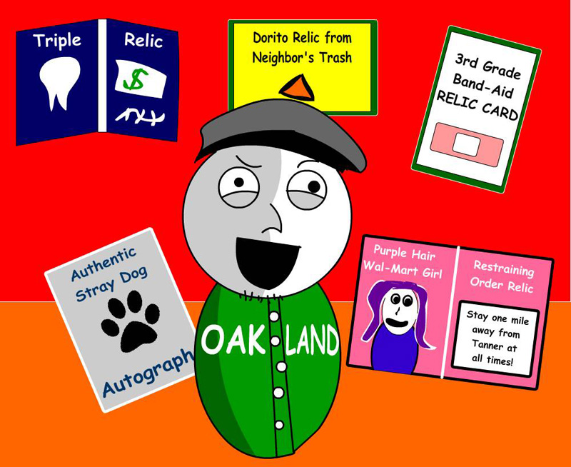
I’ve made memorabilia cards before. What about other type of “relic” cards?
Like a piece of a mum I was given by my prom date when I was a teenager (can you blame her asking me to go? I mean, look at the pic … I was CLEARLY a stud in my teen years … tie, bleached hair, pencil mustache and all!) My thumb was even hanging out of my pocket like a boss. Thanks mom for taking the pic!
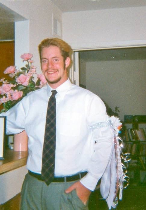
(For those of you who are too young, or too non-Texan to know what a mum is, it is a huge flowery type of thing that your date makes/buys you to wear to the dance…at least it was back in the 90’s.)
Even further … what about relic cards of life’s moments … life’s joys AND tragedies? My son went over his handlebars of his bicycle years ago only to do a face plant into the concrete. He had to get stitches on his lip and implanted one of his baby teeth into the driveway. Ah, what could have been. Instead of being a horrifying experience, I could have made a dual relic card featuring the tooth and a stitch. We could even attach a piece of the hospital bill!!!!
If that isn’t turning lemons into lemonade, I don’t know what is!
There is gold all around me – Gold … gold everywhere! BWAHAHAHAHAAHAHAH!!!! I shall rule the world!!!!!!
Wait, please don’t go. Please come back … keep reading. I promise I’ll behave more from now on…
Let’s get down to the Journey of a Thousand Jeters.
If you are NOT reading this on my blog, then the chances are, that you may have seen my thread about the custom cut Derek Jeter card I have been working on over the past few weeks using a Jeter autograph that someone gave me that came from a Clippers program.
For the first time, I opened up myself to show the progression online – to show what could possibly go into creating an entirely new design. Because of this, you may have seen several renditions leading up to the final.
I am now showing the finals, along with some (hopefully) witty commentary on each.
If you have been following along, you have seen how a design can be:
put together
ripped apart
ruined
trampled on
re-hashed
three-hashed
and trashed again
… only to go in an entirely different direction altogether.
This work has been a piece in progress for a few weeks now … it has been on my computer on and off, between working on projects, closing deals, and has even kept me up a few nights … heck, my wife has even been in here throwing suggestions.
If there is one thing that this has demonstrated (though, doesn’t show too well when being told online, it is that just because something looks good in photoshop, doesn’t mean it will look good in your hand! I tried a number of techniques and several ideas I had swimming in my head … most of which didn’t fly for this project because of the limitations with doing a cut auto.
The cut auto was messing with the whole feng shui of the design. Multiple blue colors, a pen autograph, and wide enough to ensure that it could only be used in a horizontal orientation.
In any event, I have not been thrilled with anything I have done on it … until tonight! Allow me to quickly recall all of the versions I messed with. Most of which, I wouldn’t show in public anyway, but I had fun publicly tracking the progress, so what the heck!
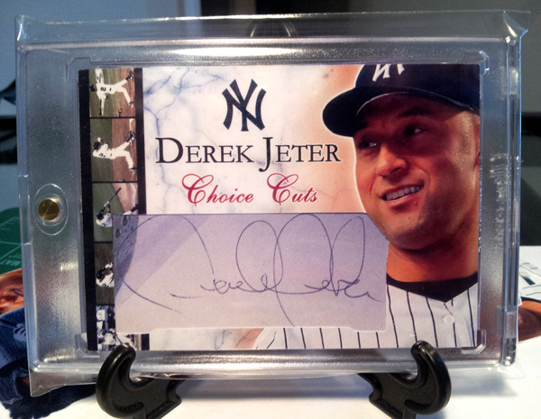
“Choice Cuts” My first attempt at using this – it came out … decent. It allowed for me to use a nice marbling technique in the background. It did NOT satisfy me to the point of where I could see being happy with this in my collection, though. Mark my words though, the marble WILL be used at some point! It has to – it is too purty!
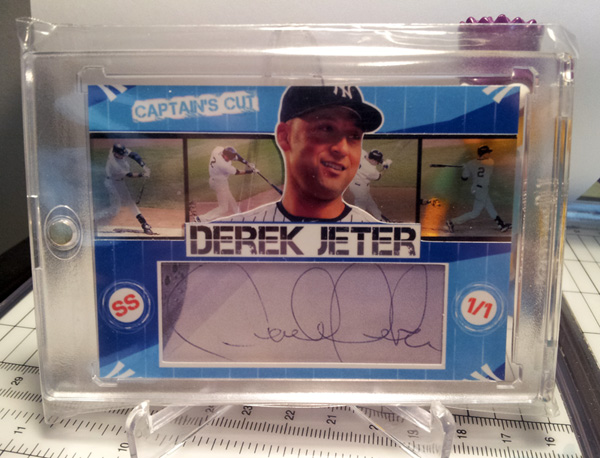
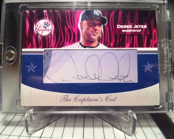
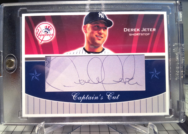
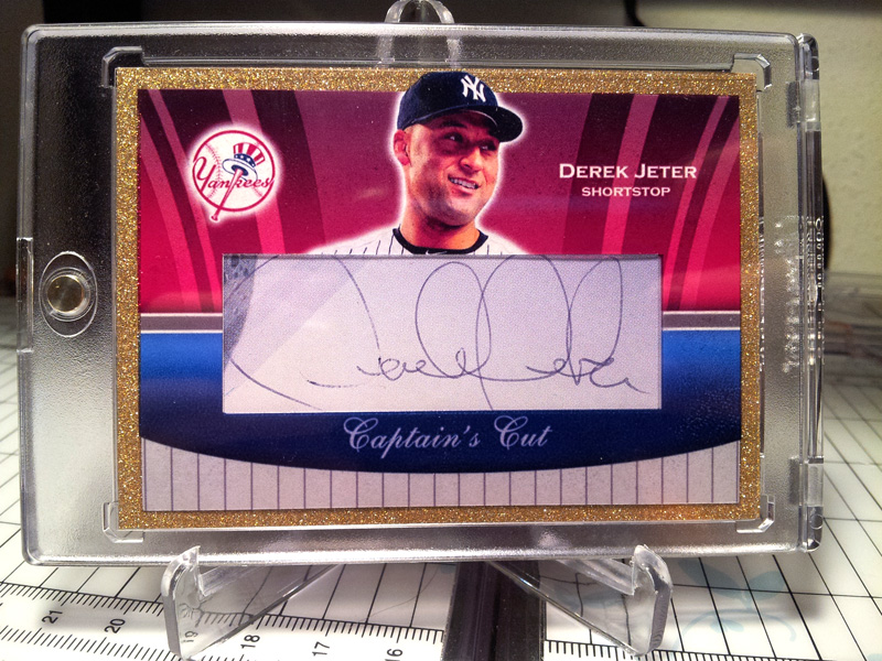
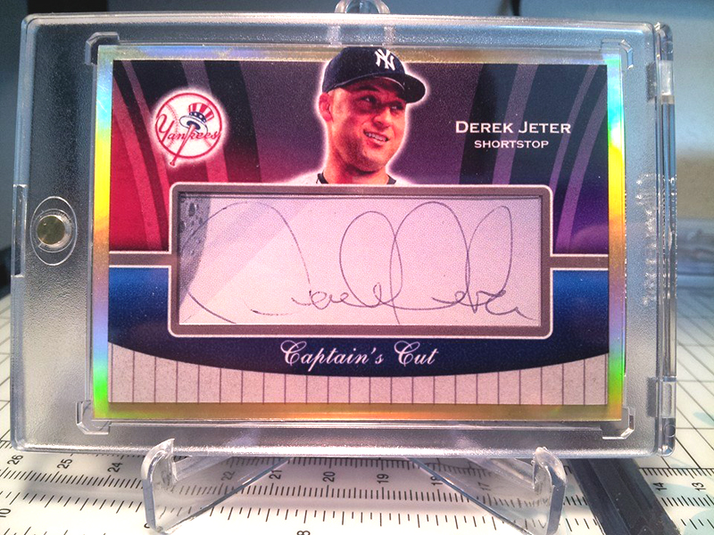
“Captain’s Cut” – ARGHH, matey! The love child of the show LOST and Long John Silver’s. The back film strip is transparent and is a really cool technique which I will employ in some other shape or form soon. The general feedback on it was that it was cartoonish. Not that that is a bad thing. I kind of like the loud colors, but this didn’t do it for me.
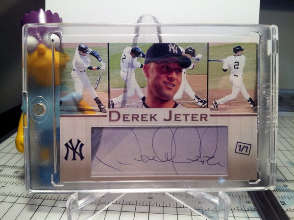
This is one where the photoshop files looked a lot better than the finished product. Definitely not something I would be happy with. The film strip had a cool machined metallic look coming through, but it did not translate well.
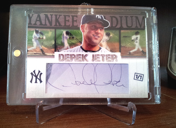
At my wife’s request, I made the top film strip take up the entire top of the card, and made it transparent. I liked this one a lot more than the previous one. I even thought for a bit “is this the one?” Nope. Not the one. I still like the concept though. This will happen in some way shape or form in the future.
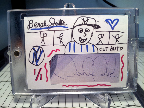
Out of frustration, and a need to make myself laugh, I did the “Toon Cuts” – I still kind of am in love with this, just because it is silly, off-beat and meshes something that looks like a 3rd grader did with the autograph of the most well known baseball player today. I just might put this on ebay as a gag for a gazillion dollars to see what happens.
Late one night, my brain had some ideas I had to play around with. The design work again was nice looking on screen, but after I produced it with the wavy foil material background, it washed out things too much. I went to bed thinking “could this be the one?” I woke up the next morning to look at it and instantly said
NOOOOPPEEEE!
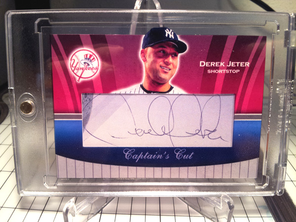
Using the same type of design, I went a whole lot more simple. No foil. Just a white border, and the background design showed up so much better on this. The name “Captain’s Cut” is back again … new and improved this time, with a fancy font! Oooooh…aaaahhhh. My wife said that she missed the “shiny”. I thought this design would satisfy me for a while, but it didn’t last long at all. I had to try something else.
I couldn’t leave well enough alone, because it just seemed…flat. I tried earlier today to do one that had a clear acetate border, where Jeter’s head would stick up on top of the clear. It looked good in photoshop and good in hand … but not all that great in pictures.
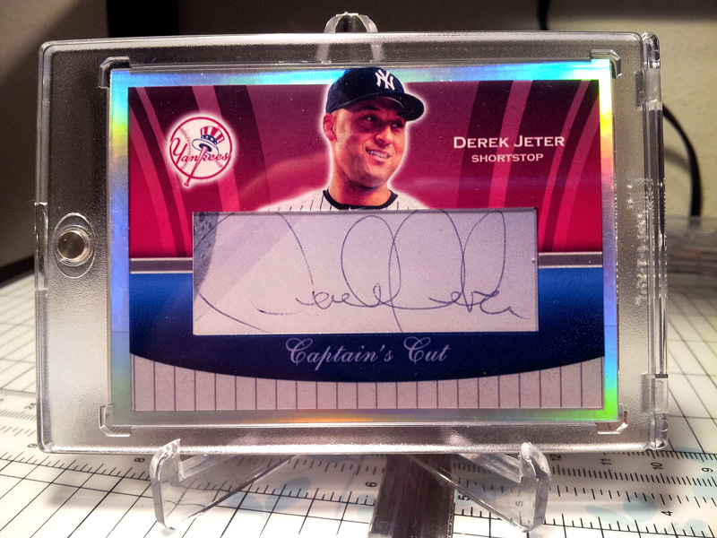
With my wife’s voice in my head saying “shiny…shiny….shiny”, I decided to try one more thing. Actually, four more things. Here they are:
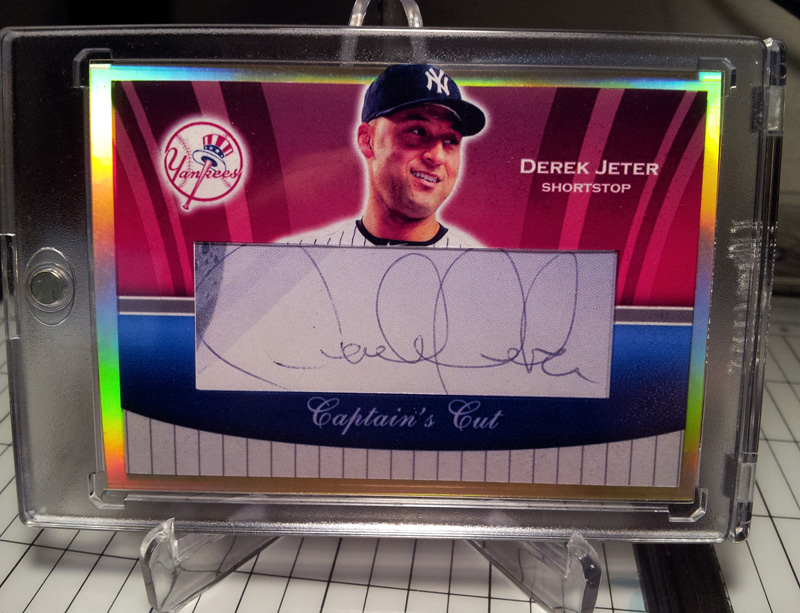
Wavy Holographic Border Captain’s Cut – (maybe a bit too glitzy)
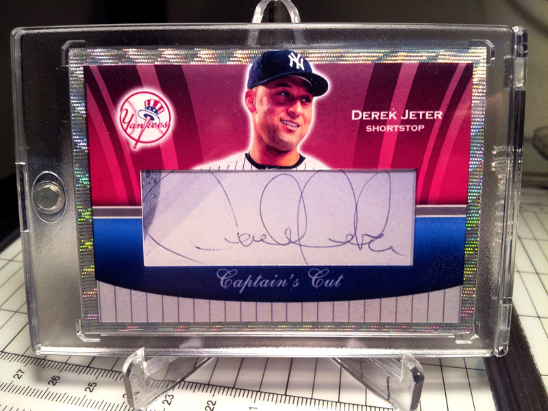
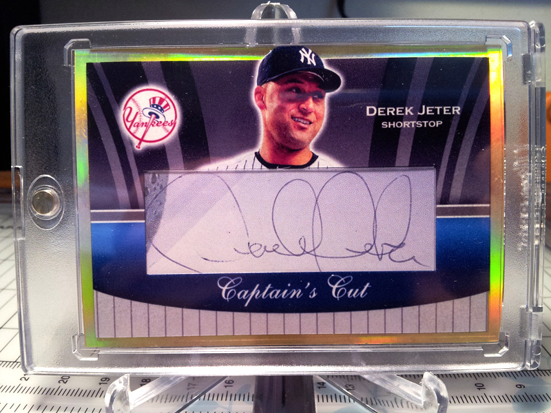
Silver Holographic Border Captain’s Cut (love the smooth reflectiveness of it)
Gold Border Captain’s Cut (the gold is a stark difference from the last two … I like it!)
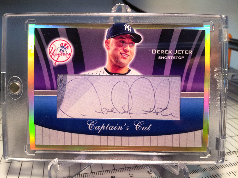
Gold Holographic Border Captain’s Cut (the silver holographic and gold border fell in love, got married and had a baby)
At the moment, the last 2 or 3 are my favorites. The cut autograph is currently “wearing” the last pic – the Gold Holographic Border design, and I am happy that I FINALLY have something I’m pleased with. I think the thing that would really make this thing go over the top is if it were a real on-card auto. An autograph portion that has some nice design elements around it, a white autograph window and signed in blue sharpie. Since that is not an option, I will gladly take this, and proudly display it in my collection.
The first time I showed her one of the last few, she said “OOOH SHINY!” That was a good sign 🙂
Showing all my drafts in progress was probably a one-time thing. I think in all future designs, I’ll probably just keep all the “okay” designs to myself and only show the ones that I am happy with, until the end. I have plenty of memories that go along with this one – from the actual autograph being given to me for free, to many of you, the readers of my postings who gave me praise and input when I asked for it.
ZZZZZZZZZZZZ
Okay, so I just woke up, and I still am in love with the last gold holographic border one, so I think we have a winner! As always, thanks for reading.
EDIT EDIT EDIT
EDIT EDIT EDIT …
Can’t help myself – I had to try a few more using my favorite border:
Leave A Comment
You must be logged in to post a comment.