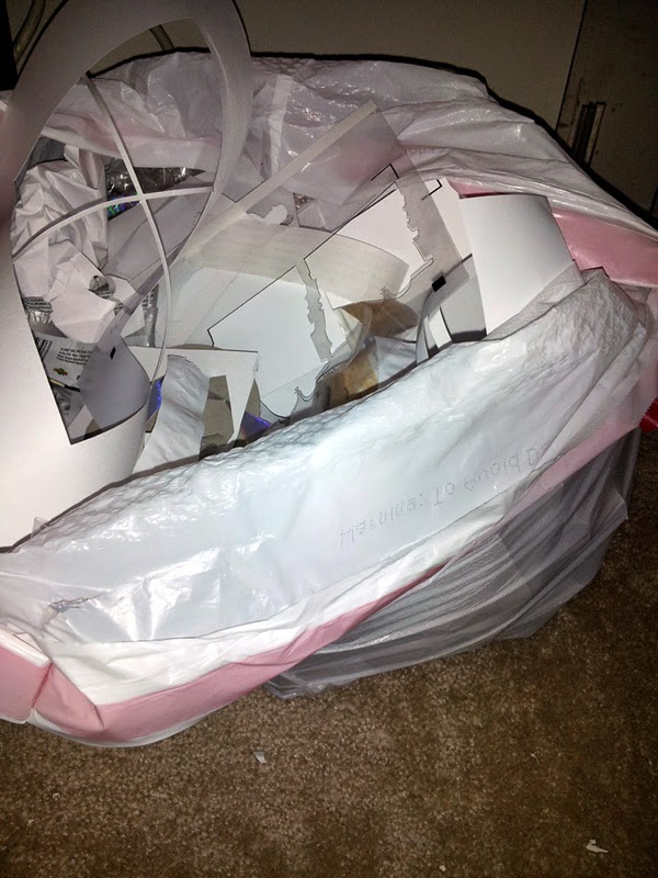
Ladies and gentlemen, this is currently what you see in my office, just next to my desk:
I can hear you thinking “Hmmmm, I wonder how many complete custom sets he has made from all this.”
Nope. Just nope. I swear, if I were an ice carver, you could give me a metric ton of ice, and I’d be lucky if I could carve out a thimble. Yeah, I’m the one who, in elementary school was cutting something out with scissors, kept getting one side crooked, and compensated by doing the other side … only to make that side crooked, etc. In the end, I’d have a nice pile of confetti.
Yup, that’s me.
I better not mislead you here though – this isn’t *ALL* from the three cards I’m about to show off here. It is over the past week or two of doing tests, doing other base customs, etc.
I’ve been doing a lot of base cards recently, and have just been absolutely thrilled with them. I decided to up the ante though, and do some more challenging cards. Please keep in mind the elementary story I told you about above, when thinking about the trash bag full of scrap, ok?
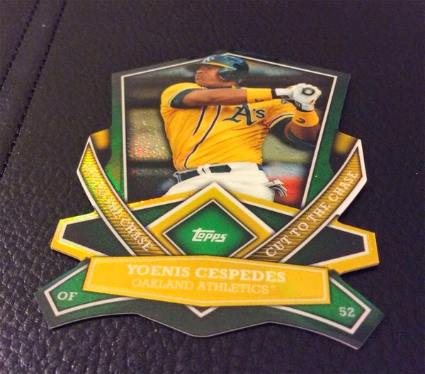
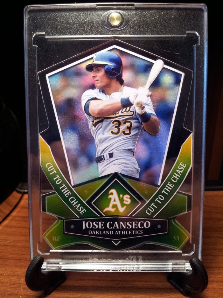
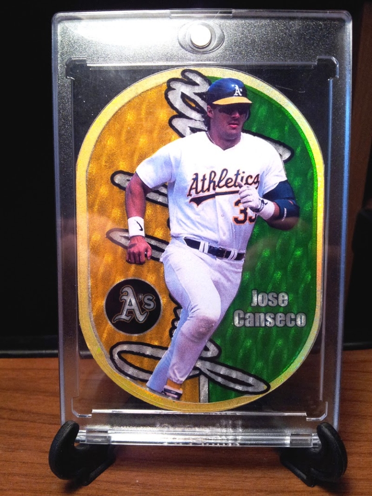
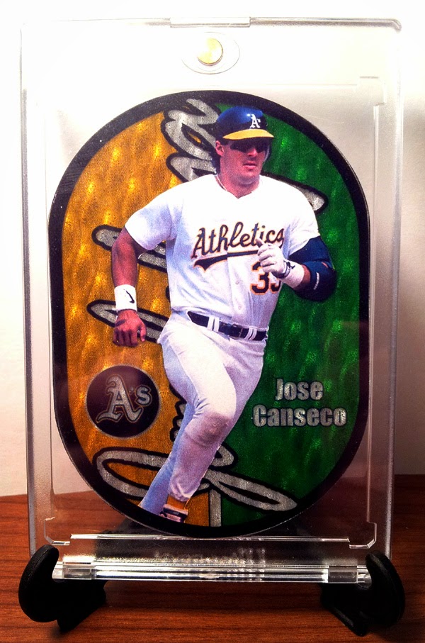
One of my favorite recent inserts is from Topps – the Cut to the Chase die-cut refractor. Again, as with every card I lay my eyes on: “why couldn’t they have made one of Canseco? That would have been sweet!”
In case you don’t know what I’m talking about off hand, here is what one looks like:
Insanely sweet, yes? I love how it is cut, love the colors, love the refractor…y….ness. I just love it all. I clearly had my work cut out for me. One thing I didn’t like was all the yellow in the factory A’s type cards in this set, so I amped up mine a bit. I think it came out pretty dang good!
I did a few things differently – I didn’t use as much yellow, I replaced “Topps” with “A’s”, put some subtle stars in a few places, and bowed out Jose’s name. You can’t see it, but it is a refractor as well.
Next up, I had an idea of doing some 90’s inserts. Why? Because it seems like everyone loves rare 90’s inserts, and I have been bitten by the bug as well.
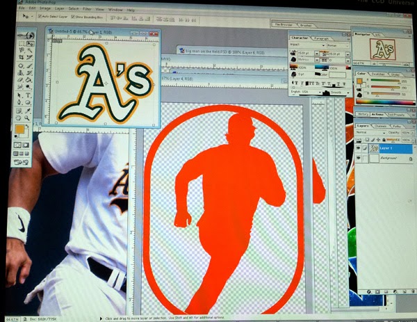
So, last night, I had on the A’s game streaming online via audio (CURSE YOU MLB TV BLACKOUTS!!!). As the A’s were pounding away on the Astros (my son said he’d hate to see them play each other because he wouldn’t know who to root for!) I decided to fire up photoshop. It is quite strange when you are working with photoshop pieces that are bigger than you on the projector, while lounging on the couch.
That sounds soooo leisurely, doesn’t it? Oh yes, I was just lounging on the couch, playing with photoshop on my project, while taking in a baseball game.
Pffft.
What you don’t know about is me doing this for 6 hours … halfway through, my wife rolling her eyes at me while mumbling something about me liking baseball cards a little *too* much (as if that were possible) and going upstairs to bed.
So like a mad scientist fueled by caffeine, I kept at it. When I liked the results, I emailed them to myself, ran upstairs and went into production mode. This was grueling, but apparently I’m a glutton for punishment.
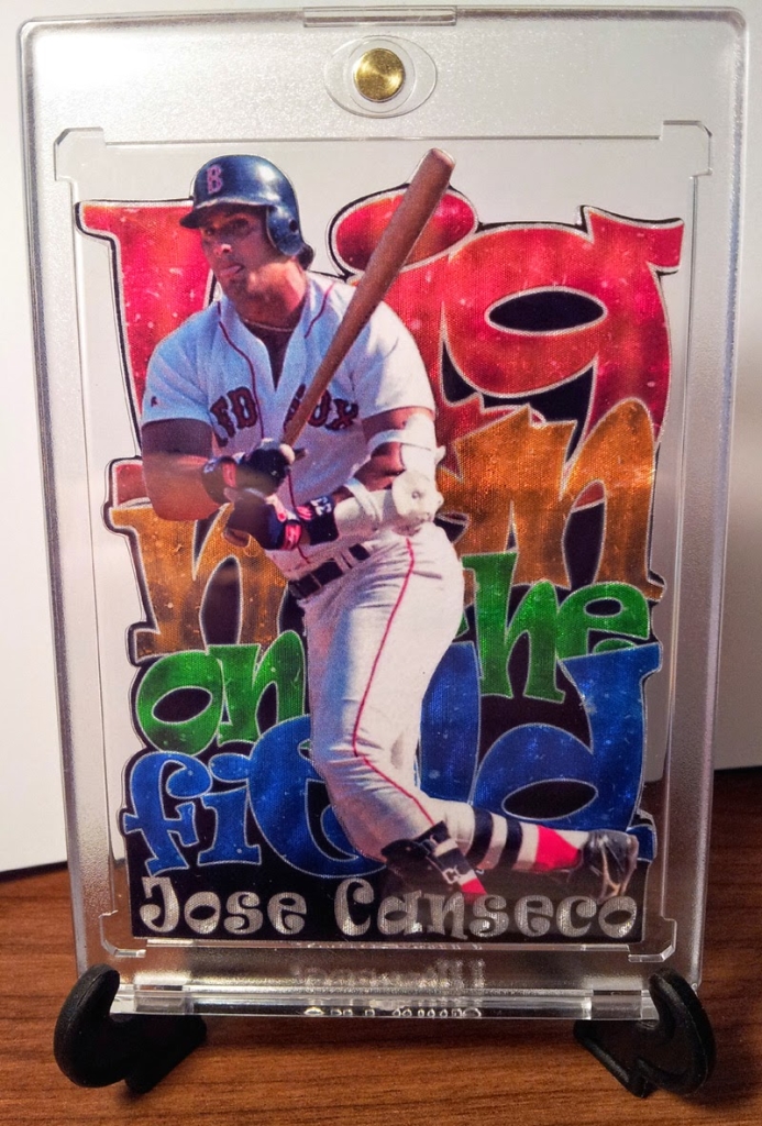
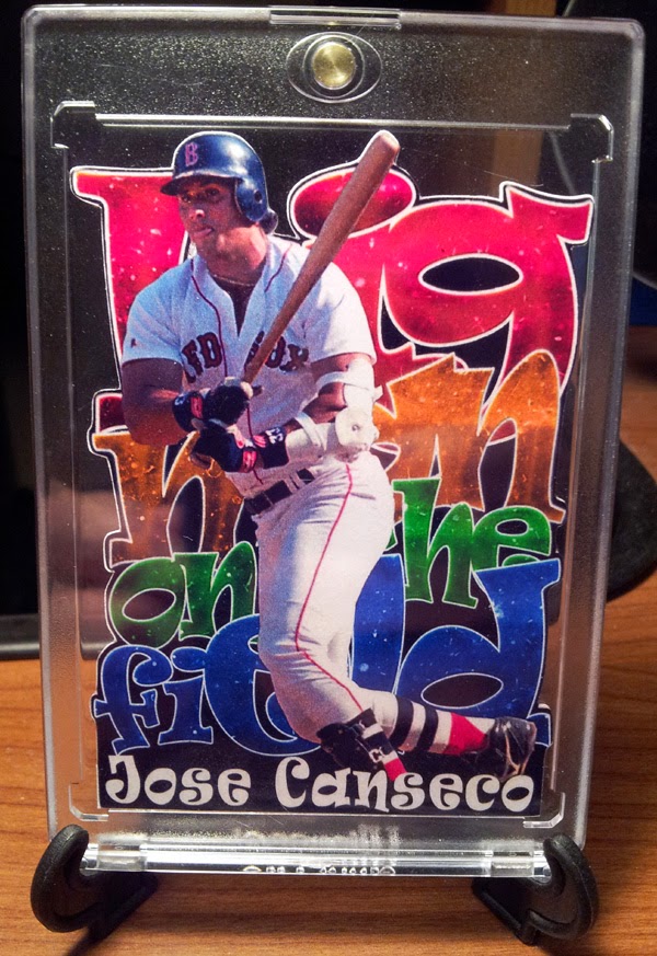
At about 2:30 or so last night, it was born:
It’s aliiiiive!!!! BWAHAHAHAAH!!!!!!! This is inspired by an uber-rare basketball insert “Big men on Court.” I rebuilt the whole thing like always. I changed it up to “Big Men on the Field”, played with the colors, texturing and used a pretty slick 3d type material. You can’t see it too well in the picture, but it came out pretty dang cool.
EDIT: I did a “base” die cut version of this because I wanted the colors of the artwork to “pop” more. I am in love with it:
This morning, I woke up and didn’t want the party to end, so I whipped up another one. This is a bit more of a “quickie” as it definitely needs more love to be perfected, but I like it too.
It is a Jambalaya – which is a 3d type die-cut basketball insert which I love as well.
Again, a few things are different, namely the naming and logo that are see through for the 3d to pop out, as well as the gold holographic ring around the card.
EDIT: I tried a version with a black ring around it:
I find that no matter what I do, whenever I’m done, I’m always like … meh…these could be so much better. I wish I could just be happy with them…and I am, to an extent. Either way, I’m glad to have been able to experiment with different materials and techniques to come up with some cool stuff to show for it in my personal collection. These are my first die-cuts, so hopefully they will only get better from here on out!
By the way, Happy Easter everyone … HE IS RISEN! 🙂
Man I would l love a 1960 topps style Ted Williams custom your work us amazing