Have you ever had one of those days where you feel like you have accomplished nothing? Well, I have had about a month full of them. Not because I haven’t been busy – but because the progress I have been making on everything seems to be so slow. Heck, I haven’t even touched creating a custom for over a month!
What started out as a simple checklist upgrade, ended up being a full blown website overhaul. I was going to write an article of how I transformed my MS Word Document checklist into a fully searchable sortable online database, but after I did that, I just kept going.
As a web developer, it has been bothering me that I’ve run my blog from blogger for so many years. The old cookie cutter template makes the designer in me absolutely cringe. Ironically enough, I’ve had several people recently out of the blue tell me how much they love my website.
See how sad the design is that I’ve been working from?
After 4 years, I put my “real life” craft to work and went to town. It was a lot of hard work, but was very rewarding and fun at the same time. This is really the first time I’ve had my hobby life (cards / custom card making) and my professional life collide. It is so much more than a blog. It is now a place where I can FINALLY showcase all of my custom work, write ’til my heart is content and show my Canseco have/want list.
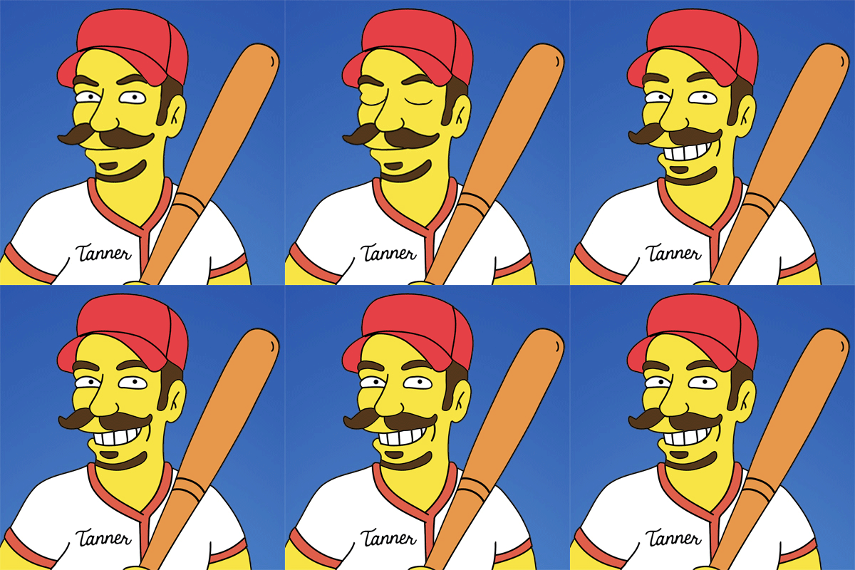
Part of the fun of putting it all together was having fun with some pictures of myself in photoshop to give my website that even more custom feel.
I went through several logo header renditions …
The monster mash version …
The monopoly guy inside of a baseball version …
The old bowler hat w/code name secret service gag…
The “I don’t know what to do so I’ll make myself laugh” version…
I ended up settling on the following.
It isn’t overpowering and is just … “there”.
You may recognize some of the fonts I’ve used. If you can’t quite put your finger on it, I’ll give you a hint:
That’s right – my son and his friend got me hooked on this. We had friends come over from out of state and the dad was really into it. My best friend is too, and I just laughed at how nerdy they are (imagine that – a grown man who collects baseball cards calling someone else a nerd!) Now, my wife son and I all check it out daily. I thought it would be fun to use the font, and my son got a real kick out of it too.
For other photoshop tom foolery, I had whipped up a few images such as the one of my family and I having a JACKPOT day at the dollar store a year ago …
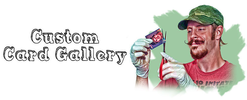
A pic for my custom card gallery cutting up a 1986 Donruss Canseco. (I would have shown me using a blow torch on a 1/1 but I thought I’d get too much flack for that!)
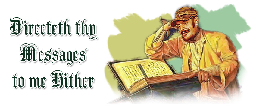
I also threw this at the top of my “write me” page. Here, you can see a 15th century mouschi checking the annual Beckett back in the day. Believe it or not, they had junk wax back then as well. They still haven’t risen in price, so it isn’t looking so good for those of you who are holding out hope for your hoards of 1988 Donruss.
I hope this dude doesn’t mind me using his body and book.
There are some other goofy things in there as well, and while tanmanbaseballfan.com is my main site, I also picked up cansecocollector.com to direct people directly to my searchable want list. I still have some tweaking/optimizing to do on the site, but I think now was the perfect time to launch. I have put up some of my favorite quotes from you all under the “kudos” page and at the bottom of the front page as well, so you may be on my website! Well, your words may be at least.
This may seem like my website is being used to promote myself, and that is because it is. Why? Because I am currently working on a bucket list item for myself. I’m writing a book! Thanks to this hobby of ours, I finally have something that I can be passionate enough writing about to fill a book. I’ve had a lot of fun (and heart breaking) stories over the past several years that I think would be great to have a place to speak at length about.
It is my hope that using this website will attract an agent or publishing house. If you know of anyone, please let me know! Regardless of if I get picked up or not, I’m going to be writing it. As a matter of fact, at the time of this writing, I’m on page 44 right now. I hope you all here have an interest in checking it out when it is ready!
So, that is part one of this posting! Part two is dedicated to my latest creation.
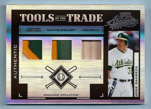
Ever since I’ve laid my eyes on the Tools of the Trade cards from the mid 2000’s (the kinds with several pieces of memorabilia in them) I’ve been in love. To me, there is something about having a card with several pieces of items that have been worn by a player. I think the way they were designed showcase the relics perfectly. It is like a near-complete DNA pallet of a player. That may sound serial stalker-ish to be so pumped about a type of card, but I really think they did them right.
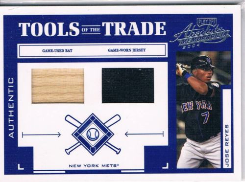
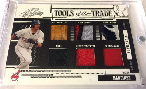
I am not a fan of the TOTT cards if they just have a piece of bat or jersey in them. I like them when they have a piece of shoe, glove, cap, etc. The more, the better! I’ve seen some with 6 pieces before, I believe.
See? To me, this is boring. The design is fine, but the pieces here are what break it.
This, on the other hand – same thing. The design is fine, but the pieces MAKE IT.
AhhhhOOOOOOOGAaaaaahhh!
It is like the ultimate type of card to me. I’d have wanted to have swapped out one of the jersey pieces for something else, but it is like having a near complete sampling of your favorite player. I don’t think they made one this elaborate for Canseco, so you know what that means 🙂
I also wanted to take it a step further, as well.
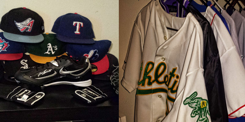
In preparing to do the signing with Canseco, I wanted to gather as many pieces as possible to do something similar. Something unique, with my own design. The pieces I had him wear were hats, jerseys, batting gloves, shoes and fielding gloves.
I already had a game used bat that I had chopped up as well, so that made six! I really did want to go bigger than the cards that were produced, and I was fortunate enough to have picked up some other items.
Before the meet, I grabbed some game used pants from Jose’s warm up pitcher. I also snagged some game used socks, and then some game used wrist bands from his previous housekeeper.
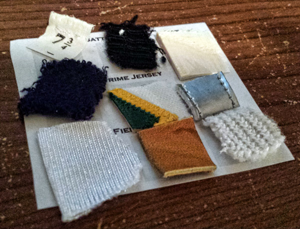
That makes 9 pieces. I didn’t want to over-do the card at all, because it would probably look like overkill on one card, so I figured a booklet would be best, but then I found a love for oversized cards.
I considered doing my own design, and I may very well do that in the future (heck, I’ve got a lifetime of material to work with here!) but this time, I decided to do a Tools of the Trade tribute card. Part of my reasoning is because 1) I love them a ton and 2) I just traded away a very nice TOTT Canseco. (Don’t worry – I got other Canseco cards back for it!)
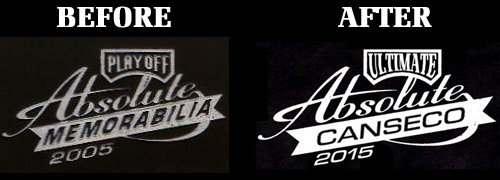
My main modification came from the logo…
After I constructed and arranged the layout that I wanted, I had to do the agonizing task of cutting up some pieces. I know that a BIG reason for going out to Canseco was to get the items worn by him, but it has just been very difficult to cut into everything for me. Here I am, sitting 4 months AFTER having done it, and I still just can’t rip into everything like I thought I would!
This was a good project to wet my beak though. I must admit, I took pieces that were discreet from the game used and player worn items I had. Pieces like a part of the pocket from the pants, or a tag from the cap, or even part of the strap of the fielding glove.
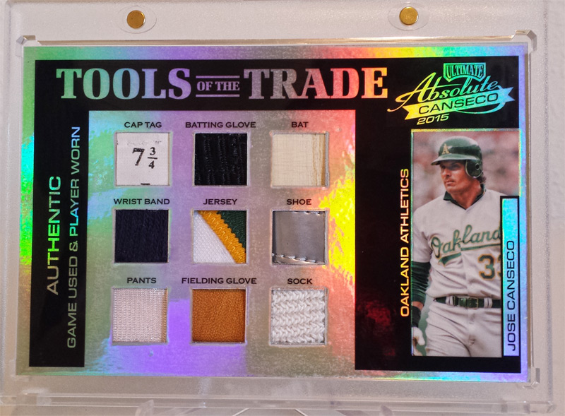
So, late last night around 2am, this puppy was born …
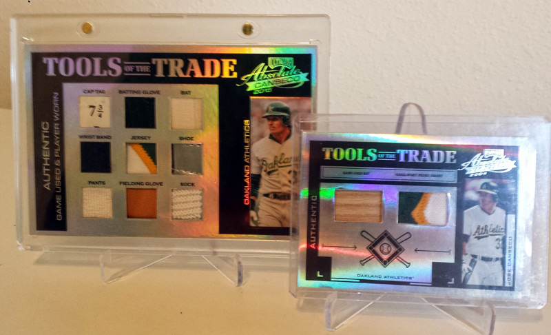
I took a pic of it next to a smaller “real” TOTT black spectrum in my collection:
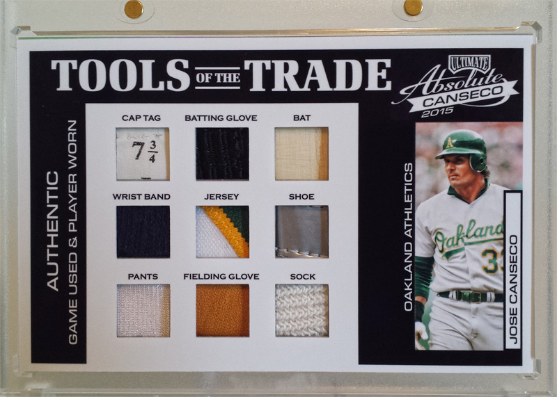
Just for the heck of it, I did a white variation as well.
And again with little brother …
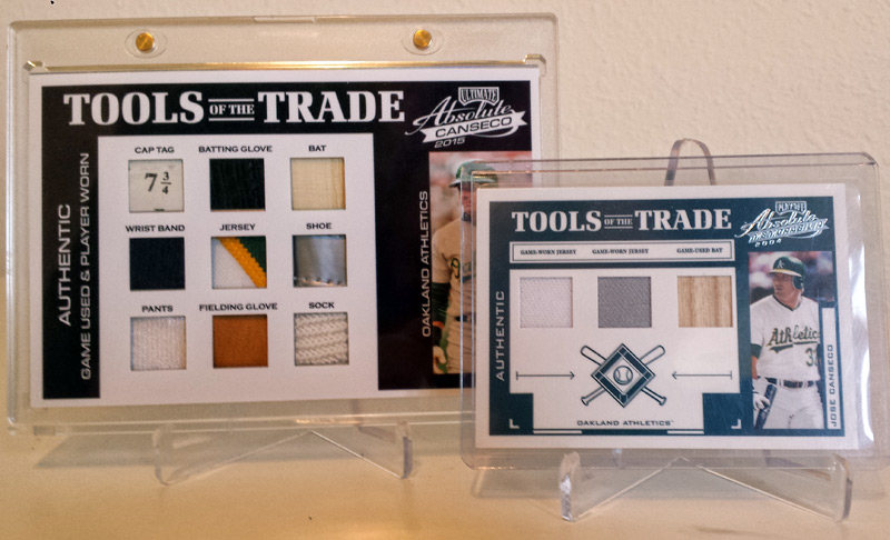
I may be in the minority here, but I think I like the white variation more than I like the black spectrum. It was nice to be able to finally put a new custom piece in my collection for the first time in over a month.
It is great having a piece that no other company has done, nor will probably ever do (that is, unless they contact Jose for some game used socks, etc. in which case, I’m buying what Topps/Panini/Leaf put out!)
Thanks as always for reading, and remember …
UPDATE UPDATE UPDATE
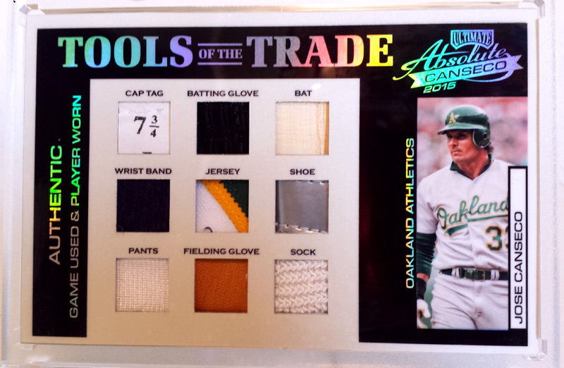
Since I liked the “crispness” of the black & white version, but the shiny of the spectrum, I decided to marry the two …







Leave A Comment
You must be logged in to post a comment.